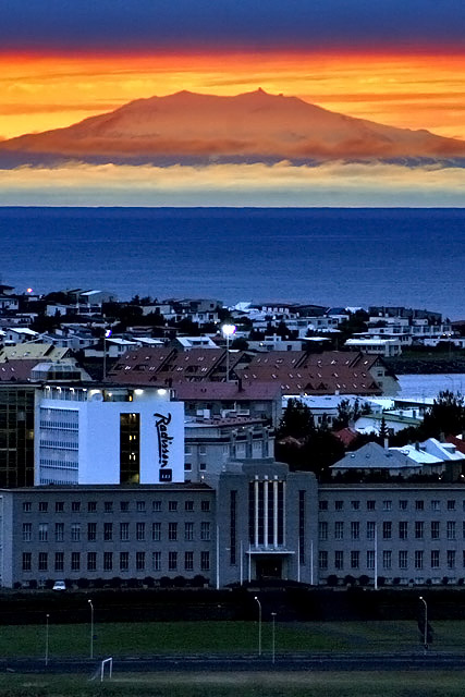
Wow, what a great shot of a Reykjavik dawn! It justifiably scored well.
Now, as to composition. The layers of color and texture contrast well. I'd suggest, if at all possible, that you try this shot from some angle where the Radisson Hotel isn't visible. The bright white is a distraction from the lovely colors that make up the major part of this beautiful image. You have plenty of "High Contrast" without it. The large, long building in front is a slight distraction as it is neither centered in the foreground, nor enough off-center to add interest to the composition. However, I do like the city of Reykjavik to appear in the image. It gives another layer of texture and reinforces the contrast between nature's work and that of man.
Technically, I think this is just fine. I wouldn't change a thing.
You have a beautiful city (I visited it some years ago, and remember it well) and you have captured a special moment. (come to think of it, in September, seems to me dawn lasts quite a long time.)
Wow, this works as contrast on a couple of different levels: The contrast of the high-contrast mountain with the much lower contrast village, which is sitting in the shadows of nightfall or another mountain.
I really like this image. I believe that you included the buildings in order to further show contrast between nature & manmade, but I still think I might have preferred it if you had cropped out the town. Beautiful nonetheless.
stunning view. unless you were shooting for the radisson i would have just worried about the top half of the pic. perhaps you were going for the contrast of nature and man...but i don't think it was fair to downplay nature in this case.






 Add photograph to your favorites
 Add photographer to your favorites

 Photographer found comment helpful.


