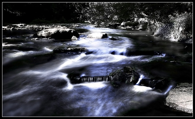
First thing I notice about the image is the nice tonal range, and how it meets the challenge well.
Composition wise - I think there's a lot going on. A tighter crop would have made it less busy, as well as allowed you to boost the contrast further for impact.
It appears a bit on the dark side on my monitor, maybe increase the brightness just a tad.
I also noticed that the image is only 102kb. You should try to use the full 150kb available, to minimise compression artifacts. In photoshop, that option would be 'save for web', where you can set a compression level on a 1-100 scale.
You have some very nice photographs in your portfolio. Keep up the good work!
I think this could benefit from an even longer exposure. Has this been partially desaturated? If it has (could be my monitor) then i don't feel it works too well. 8.
Love the tones - they are great - and really like the long exposure. I'm not crazy about the border though and the horizon seems off to me (and not in the artistic way). Great composition otherwise and certainly meets the challenge well.
I like the perspective on this. The deep blues is a nice contrast to the white foam of the moving water. I feel like I'm standing right in the water myself.






 Add photograph to your favorites
 Add photographer to your favorites


 Photographer found comment helpful.


