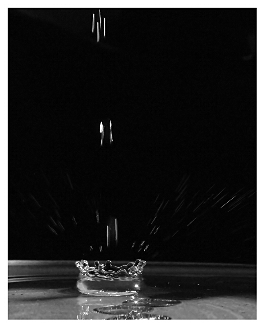
Started off trying to shoot a version of 'impact of a water drop' with the emphasis on reflection rather than refraction: but it just looks dead boring, certainly in B&W. So I thought the moment after impact would be intersting - that's boring too: but if you set up a stream of drips you get a far more intersting pattern of splashes.
Bowl of water set in a beam of sunlight in an otherwise darkened room (this gives a direct but still slightly suffused light), camera on mini-tripod looking across the light, and about 300 shots. Cropped, sharpened a little, and of course de-saturated.
I also like that there is noth motion and stopped motion here, and the definition on the first ring of the splash.
Statistics
Place: 38 out of 147 Avg (all users): 6.1624 Avg (commenters): 6.8000 Avg (participants): 6.0952 Avg (non-participants): 6.3333 Views since voting: 1432 Votes: 117 Comments: 18 Favorites: 0
Intersting comments - thanks to all. Two things not mentioned before: this shot is SO much more interesting in colour for one, though the intent was to shoot something about motion capture that had to do with reflection rather than refraction. Also, it actually IS level, horizontally: look at the nagle at which the water is sitting rathe than the edge of the bowl. Unfortunatley, it was too tricky a capture, and I hadn't enough time to get both bowl and splash straight with another set of shots. Still. Glad some of you liked it.
*Critique Club*
Well, I will admit that I'm not seeing this the way you had intended. I found the splash itself to be interesting, but the extra falling objects to be a distraction. I expecially don't like the ones at the very top. Are they coins you were dropping?
Anyway, I like the crown created by the splash. It is almost a thing of perfection. I would have cropped out the top thing of falling objects, and even the second. So that the shot included the crown, and only the little splash marks coming from the crown. Yeah, maybe that does make it a bit 'cliche' but I think things are cliche for a reason. Cause they look good, and are quite effective.
I think having this in black and white is enough to set it apart from 'the rest' though. Usually people are putting all kinds of colors and patterns in it. Black and white actually accents the crowns edges to me. Lets us see JUST the splash and not have to worry about other elements.
It looks like you need a very slight left rotation, as the far edge of the bowl appears to be leaning to the right a bit.
Overall a nice shot, just would like to see that tighter crop.
~Heather~
This is definately one of my favorites this challenge! Great job. I think you may get comments that there is too much negative space, but I think it really works here. great focus and contrast. Good luck in the challenge:)
wow. great shot. love how the bottom splash is still and the top and side ones are still in motion. black and white looks excellent. interesting that the splash look slike a bottlecap, if you put it upside down and did some editing on the background it would make a cool absolut ad. 10
Probably don't need the top incomming drop, then you could focus the composition on the splash and lower falling drops. But I really like the shadow behind the ring-splash, makes the splash really stand out






 Add photograph to your favorites
 Add photographer to your favorites


 Photographer found comment helpful.


