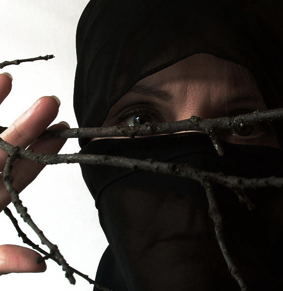
I had no idea what to do with a BRANCH shot and then I thought of all those cool shots people had taken with women, focusing on their eyes, with wrapped heads. All I could find was black and at first it looked like a burkha, but then with the branch and me peeking through it, I thought it appeared more Ninja-like.I might get slammed because the right eye is obscured, but this is about the BRANCH - not the face. Adjusted curves, sat and desat color, crop.
Statistics
Place: 182 out of 432 Avg (all users): 5.1404 Avg (commenters): 6.1000 Avg (participants): 4.9527 Avg (non-participants): 5.3431 Views since voting: 1304 Views during voting: 399 Votes: 285 Comments: 26 Favorites: 0
I agree with vfwlkr's bottom line, this should have placed higher. its creativity should have been better rewarded than it was! should have been well above the 50th percentile IMO.
I didn't realize this shot was you (or yours)! Very cool photo. I scored it a 7. Love the way you can see through the material. I like the fact that you're looking around the branch - seems more stealthy and ninja-like to me. Great shot!
Greetings from the critique club Look whose photograph I get to critque? Judy, you're an inspiration!
As soon as I look at this photograph, the first thing that strikes me is how different it is! Next, the attention is drawn to your eyes, which are well lit and in focus.
Composition wise, as you mentioned in your photographers comments, the branch is obscuring the eyes, which are the key focal points of your entry. If they were leading to the eyes, but not obscuring them, I feel it would have worked better.
You've not mentioned the aperture used, I wonder if using more depth of field could've brought the branch in focus too.
I like the lighting on the face, but seems a little harsh on the hand.
Your image size is only 74KB, which is half of the maximum allowed. I would recommend using something close to 150KB, to mimise compression artifacts and preserve detail.
Overall, I like the photograph and think it should've placed higher. Keep up the good work!
nice texture around eyes...I would have liked to have seen the area around the mouth totally dark to match the dark around the eyes...but then, you can't have everything.
Don't concentrate on the finger, or you'll miss all that heavenly glory
Definatley an original entry for this challenge. I perhaps would have liked to have seen the ninja more concealed through a slightly more busy set of branches. After all, invisibility is the code of the ninja. Lighting seems spot on, and the skin tones have been well captured. The contrast between ninja and background works quite well, but I myself would have opted for more of a darker gritty background. An image that intrigued me anyway. 7
The lighting and focus is good. However, looking at the title and the picture in general, the branch seems kind of out of place. But this picture is creative and interesting though the branch is a bit random.
Before I read the title I thought this was a clever analogy to the branch of the children of Abraham, with the Hijab on the model. Pity because it's much stronger than a ninja?!?! holding a twig. Where's the connection?
interesting idea, and a good pose. I think there should have been more light from the front and that the fabric covering the face should be either darker or removed, depending on whether you want to keep it "ninja" per se.
branch is obstructing eye, eye is under-exposed (no detail can be seen). finger on the other hand is over-exposed and burning out. an interesting idea, but technically flawed. branch is also out of focus, w/o enough light to separate it from the black cloth.
AHHHHhhh! The feared Ninja Princess, runaway, runaway! Do not look the Ninja Princess directly in the eyes or she will disembowel you with her deadly Ninja Branch! Hehe, technically a great shot, IMO, but I absolutely love the humour! You go Ninja Princess! Good luck, I hope you get a good score, I'll do my part and give you a ten for such an inspiring shot.





 Add photograph to your favorites
 Add photographer to your favorites

 Photographer found comment helpful.


