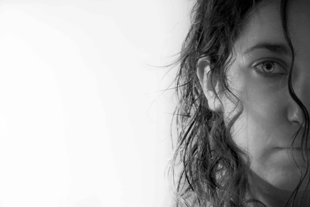
This is a very interesting shot. I like the use of negative space used on the left, adding the white for your contrast. But on the left you really have more grays than any set black, not really offering anything for the High part of the contrast.
The face on the left has a very good expression, it really fits the shot overall. The softness works well and the hair strand right on the edge is also a great touch. A bit more darkness on that side would really make this shot jump out.
Nice shot. Focus is a little off - although it could be my monitor. Like the high key effect. Maybe a little more shadow on the far side of the face? 9.
This is a cool composition. Good take on a classic. Seems like focus could be a little bit sharper, the eye just doesn't seem to really 'cut' through. For high contrast, I am thinking maybe a slight boost to your darks, by maybe a levels or curves adj. , could strengthen the presentation some.
The composition is daring and very interesting, but the contrast is not very high on the face and hair of the model. The eye, however, is indeed well contrasted.
For me, while there is some contrast, the gray values of the model are very similar and not dramatic as compared to others in this challenge. Again for me, the white is almost overpowering, but I do like your composition.
this is really cool. Okay, its late, my vocabulary is limited. Don't care for that much negative space but I think it works for the most part. Don't like the title but with the voters, I can see why you went there. Soft but not badly so. 7, will probably bump once I've been through everything else.





 Add photograph to your favorites
 Add photographer to your favorites


 Photographer found comment helpful.


