I'm a bit weary about entering this for a couple reasons: 1) I'm not sure if this is "High Contrast" by voter standards. 2) My "Save for web" option always converts back to Adobe RGB for some reason, even though I have the "Use Document Color Profile" option checked - so I had to save this in a couple of steps, and that led to a slight (but noticeable) loss in quality from the original.
---
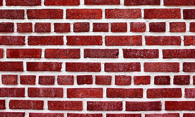
Post Challenge: I guess the thought of placing something amongst the bricks to focus attention never really occurred to me.. probably because I was hoping that this would be considered more a study of pattern and repetition than anything else.
I was hoping to somewhat mimic the work of Andy Bell: here and here, among many other photos of his style. I think to have better done this the bricks should have been smaller and in higher number. Any thoughts would be appreciated.
Statistics
Place: 271 out of 343 Avg (all users): 4.9265 Avg (commenters): 5.1111 Avg (participants): 4.7919 Avg (non-participants): 5.1354 Views since voting: 962 Views during voting: 342 Votes: 245 Comments: 11 Favorites: 0
One of the joys of doing these critiques is that it forces you to take the time and effort to really look at an image and bypass quick first impressions.
So here I am being forced to look at a brick wall;) As a high contrast study it works. But there is no focus point to satisfy the eye...until you are forced to stare at it. The brain, searching for something, anything, to focus on starts to notice subtle differences in each brick and area of the wall. Now it notices the colour differences in each brick. The way the light catches each one uniquely. Then you find Pink Floyd's 'Another Brick in the Wall' lyric going round and round your head...and you begin to think philisophical thoughts about how it relates to people and capitalism...and then you remember it's just an image of a brick wall:))
Good clarity, nice and sharp. Good lines. I feel like the image is lacking a strong subject though. I'm thinking, especially for this challenge, if you had something about plate sized that was bright green placed on the wall at a thirds intersection, this could be a very strong image.
Very nice brick wall, very good contrasts in the colors but the picture is a little boring. It would have been great to see something or someone off centered against the wall.






 Add photograph to your favorites
 Add photographer to your favorites


 Photographer found comment helpful.


