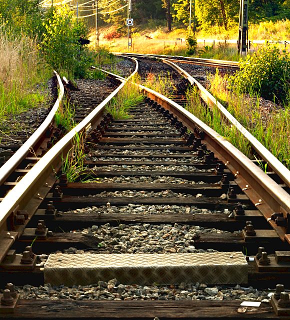
I wasn't really sure if I should upload this photo or not. I still think something is missing in the photo. Probably I should have tried a shorter lens.
Post processing:
Converted from RAW to JPEG in Bibble 4.3 with contrast on +100
Cropped
Shrinked
Unsharp mask radius 70, amount 0.5
Desaturated slightly and increased lighness
Increased red and yellow saturation
Unsharp mask radius 0.5, amount 0.5
Statistics
Place: 72 out of 432 Avg (all users): 5.6536 Avg (commenters): 6.4545 Avg (participants): 5.3893 Avg (non-participants): 5.8859 Views since voting: 872 Views during voting: 381 Votes: 280 Comments: 16 Favorites: 0
COMPOSITION You mention in your photographer's comment that it feels like something is missing from the composition, and that maybe you should have tried a shorter lens. I take that to mean you wish you had a wider field. As it is, you have achieved significant depth. The stones in the foreground are all sharp and you've got good detail right up to the foliage. I like the way you've used the tracks to create meandering lines that lead the eye up and out the left side. The background is a little busy with the telephone poles and power lines. This might have worked better with a different location where you had less clutter, and maybe even a longer stretch of track to work with. I wonder what was right behind you as you shot, both from the standpoint of the above clutter comment as well as the lighting differences looking back the other way. As I write this, I'm scrolling up and down to look at your picture as I write, and I find that when I scroll in such a way as to clip the top centimeter or so off your photo, I think it improves (clipping the power poles and lines). I think the net effect is to let the rail tracks be the primary subject and lead the eye up and off with no distractions interrupting.
TECHNIQUE Excellent job achieving the depth you wanted with your long shutter and lens stopped way down. You might have even pushed it one stop further; you have plenty of light and even some blown highlights (rail by the road and the tops of the railroad tracks). The grasses and trees seem a bit too yellow also, maybe knock down the saturation a bit or even shift the hue a bit to green them up.
OVERALL IMPACT I think your photo might have had more impact with the above mentioned crop and hue shift. After writing the above two paragraphs, I read your voter comments and see that several others have also mentioned the crop issue. It's a good photo but clearly didn't "wow" the voters. You have a good eye for composition though. I'll look forward to seeing more of your stuff.
For some reason, I like this shot. It looks very rural and deserted. I don't like the hot areas but they are hard to avoid and still get the detail in the shadows. 9
Like the contrast and saturated colors, nice lines adn details are sharp. You might have pulled back and up a little to remove the power lines and road, and accentuate the farthest set of tracks.






 Add photograph to your favorites
 Add photographer to your favorites

 Photographer found comment helpful.


