Rad photo. Somehow it reminds me of the movie Moulin Rouge. Perhaps it's the lighting, but i'm not sure. Anyhoo, if i'm ever able to take a picture like this before I die, i'll be happy in my death-bed. Excellent job
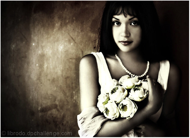
I've looked at both the color version and this one. I prefer this one a lot more as the contrasts come over a lot better. The composition is excellent as I can only expect from you Manny. Choice as ever. The vignetting effect comes over well, giving the subject a natural framing. The pose with the flowers, the look on her face, it all fits together in harmony. However the processing bothers me a little. I would have prefered to see grain in this. Grain would have come over a lot better for me, not too much just a little. This is too soft in the face and arms, almost as if you had put NeatImage into it. Also the flower on the left is blending too much into th sleeve of the girl's top. I would have liked to have seen some more detail there. Other than that good! Lighting is good, just a touch too harsh from the left. The eyes are perfect and overall, a super photo!
Wow...not really sure what I can add that the 56 comments haven't already mentioned.
Definately high contrast. whites are white and blacks are black. Love the lighting on the background, I think it adds to the shot in my opinion.
The focus seems a tad soft, but with the feeling of the photo, I don't think that hurts this shot at all.
Her face seems blotchy. Not sure if this is editing, or lighting, or what, but seems to have some un uniform tones on her face.
Can't really see much of the flowers except the color part, but they do look good. I think maybe the whites there are a bit too white, but that's just my opinion. I'd like to see more detail in the flowers.
Overall an excellent image and not really much to improve on here.
Congrats on the placing! ~Heather~
I saw this during voting and thought it's very beautiful, but I would have never guessed it's yours. Glad to see it did so well.. I really like the processing on this one. Looks like something you would happily hang on a wall :). Congratulations!
Guess I have to go against the majority here on this one Manny.
Composition and subject is, as always, first-rate.
In this instance, I don't feel the processing was in your normal high standards.
Too harsh in many ways, especially around the flowers, and a bit odd around her right upper arm (focus/clarity?).
Did you consider a softer finish on the flowers by chance? A bit of gaussion blur?
Just personal preference/opinion.
Congrats on the Magazine shots by the way.
Have to dissagree here. I think this is the best shot you have taken, and one of the greatest shots on this site. But that is just my opinion. And to me that is the most important opinion.
Well done
I Love it
Guess I have to go against the majority here on this one Manny.
Composition and subject is, as always, first-rate.
In this instance, I don't feel the processing was in your normal high standards.
Too harsh in many ways, especially around the flowers, and a bit odd around her right upper arm (focus/clarity?).
Did you consider a softer finish on the flowers by chance? A bit of gaussion blur?
Just personal preference/opinion.
Great finish manny. I find it interesting to compare this witht he color version, because this one seems softer (and not in a positive way) than the color one. Whatever, very strong image, as usual. I think this is the first time I've beaten out onw of your shots, so i'm happy :-)
Considering that this was shot outside and not in a studio, this image is wonderfully soft and well lit, congratulations with yet another great photo..
Good shot. Her look and tones of her face are great plus the placement of your model. Though it looks a little over processed for my liking I think it will fair very well.
Fit Challenge Criteria: 2/2
Contrast/Color: 1/2
Composition: 2/2
Photo Quality: 1/2
My Subjective Affinity: 1/2
Great composition and lighting (mostly). I think the lighting on the person is a little harsh, but I really like the lighting on the background. I also like the background material, whatever it is.
I have to say my first impression of this shot was jaw dropping, not kidding. I love this shot, you've nailed this challenge and then some! Congrats to you and your model for creating such a beautiful image. I love the selective de-stat. and sepia tones. Model's pose is very natural, and the choice in delicate apparel and flowers are a wonderful contrast to the rough textures / paint behind her. I could go on and on but I'll just say, 10, 10, 10!
The blowout of whites on the flowers (and the balance on the face) is a bit distracting, but all other aspects of the photograph are good. Good mood, nice tone, good model placement with good expression and nice undistracting background. It is just the balance of the light that might be improved. 8
Perfect
my pick for the top so far.
Love it.
Love the colour treatment
love the textures on the wall
love the pose.
I really can't find anything wrong with it at all.
A big fat 10 from me
Good luck
Beautiful composition and contrast. The model and flowers seem to have a very different feel than the background though (and I don't mean contrasting, but in processing).
Wow. This is fine work. The posing, model and contrast are just perfect. I expect you will either ribbon or top 10 with this image. Congrats in advance!!
Locely portrait - great lighting and eye contact and nice use of negative space - I like how the gritty texture of the wall behind adds to the feel of the photo - it gives it a solidity.
Awesome shot. The tonality and the depth of it is excellent. I love her placement in the shot and the bouquet with the pearls brings your eye up to the whites of her eyes. 10






 Lotus Mood
 Add photograph to your favorites
 Add photographer to your favorites


 Photographer found comment helpful.


