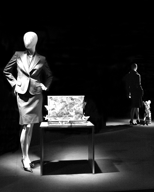
Display window at a department store, shot through glass at night, hand held.
Post. PSP8 (I have 9 but when I try to use it, the save as function does not work!) One step Photo fix. Layer adjustment for hue and saturation (cause the photo fix leaves the image with a mild, dull sepia like tone), Saturation to -100. Layer adjustment for Channels. Opened in PSE 3.0: Crop. Cloned a few aberrations: A small bright white spot on the floor, a street light reflection on the front mannequin's lapel, a few small bright reflections around the rear mannequin. The dark background was grainy and splotchy so it was burnt to make it even. Resize. USM.
Statistics
Place: 60 out of 343 Avg (all users): 6.0206 Avg (commenters): 8.5455 Avg (participants): 6.0065 Avg (non-participants): 6.0449 Views since voting: 939 Views during voting: 345 Votes: 243 Comments: 14 Favorites: 0
This definately hit the challenge on the head. Great contrast. Nice darks, nice lights and little in between and it works great.
Focus is right where it needs to be. Nice crisp focus on the subject and we get a lot of detail in the person. I did see one comment though about the thing on the table and I too was thinking that while it does add to the contrast, what the heck is it? I'm willing to accept that it's just an abstract sculpture, and realizing that you didn't put it there, can accept the fact that it's just part of the scene, however, it would have been nice to have something relevant there. Not sure what, but at least something recognisable.
Lighting is really great, I think that's what makes the photo what it is. It's in the perfect spots and creates a nice black background for the contrast theme.
The front of the shirt is just a tad bright on the main subject, but not enough that it affects the photo much at all in my opinion.
The placement of the subjects is great, although again, not something within your control, however, you DID decide where to place them within the frame of the photo, and I think you did a great job there.
~Heather~
After reviewing the photos again, I am upping my score on this. It is most certainly high contrast and the graphic sense of it is great. It has a geometric edge to it which I find very suitable to the black and white.
Goodness, well there's quite the contrast here all over the place. The faceless figure is a bit disconcerting but nonetheless I think the focus is good, nice use of lights and the two clear yet seperate interest points is a nice change. I think my only gripe is that I can't, for the life of me, figure out what is on the desk next to that main mannequin. It seems very busy and I think a lot of detail about it has been lost, which if the details of it aren't important then the item itself probably isn't important and thus is just clutter. Other than that I like the composition and the use of black & white - which seems to be many people's idea of instant high contrast - actually works here. Nicely done. I gave a 7.






 Add photograph to your favorites
 Add photographer to your favorites


 Photographer found comment helpful.


