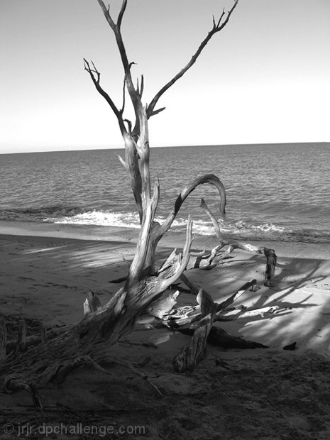
I really like this image composition, my two buts are: I'd like a bit more B&W contrast (just a teeny smidge towards black and pulling a bit more shadows out), the image seems a wee flat at this B&W level and the crop is a wee bit tight at top--I'd like to see the end part at that top branch. Otherwise a very nicely branch photo.
Very nice love the lighting. A few minor pointers, try composing it so you can see the top of the branch, and cut a little off the bottom as that part is not important. Also, try to keep the horizon level.
I like the tones and most of the light and shadows --to me it feels like a bit too much shadow on the bottom -- I also think it would be more effective if the branch was not centered in this case
I love the ocean and have never lived over 5 miles from it. I love this picture not only for its beauty but because i can almost feel the smoothness of the wood
Hmmm. Close to great. A slightly different composition might have helped this one. Particularly on the sliced top end. Looks good though, keep up the work on this technique.
I think partly the harsh shadows and lighting are a bit distracting as is the slightly odd interaction between beach tide line and horizon.
I would have preferred a less tight crop. It would give the image breathing room. I like the tones. Horizon slightly off - with a line that straight and that noticible, you need to take care. Lighting provides texture.
Excellent shot, just one thing its not horizontal. This picutre has great potential however better planning would have giving it a good score. once again beautiful shot.
Very dramatic branch to photograph. The tilt to the horizon is distracting to me, but can be easily fixed. I also might have liked to have more space at the top of the image so we can see the ends of the branches and they don't get cropped off.
AAch. the dreaded tilted horizon! I have been crushed for this same flaw so you have my sympathy. To my mind a greater eror is it looks like this was edited to print rather than for the screen where the tonal range is too narrow to show off all the dark tones in the shadows. If you had dodged out some more detail it would have scored better. I like the Westonesque vibe, of course he would have closed in on one element, but the feel is similar
I really like this, good choice as B+W. Only 2 things i might change - make the horizon level and maybe crop about an inch off the bottom -its a bit distracting, and i tend to focus on that rather than the branch. Good luck dood. 7
I wonder how this would look if your main subject was less centered. Say off the left more? I like your choice of black and white. the highlights are nice too.
would have liked it more with a flat horizon - or even an obviously purposefully tilted one - this looks like a mistake - rest of the picture is great though and still worthy of the high mark
I like the splash of light on the branch, and the well placed breaking wave. The horizon is tilted tjhough. And you could do with cropping the large shadow below the trunk on the bottom, and to even the composition (rule of thirds) crop the top slightly as well.






 Add photograph to your favorites
 Add photographer to your favorites


 Photographer found comment helpful.


