I came back to finish the critique but for some reason the edit and quote buttons both returned a 404 error. Excuse the dual entries. (I created the quote manually)
Originally posted by cpanaioti:
*Critique Club*
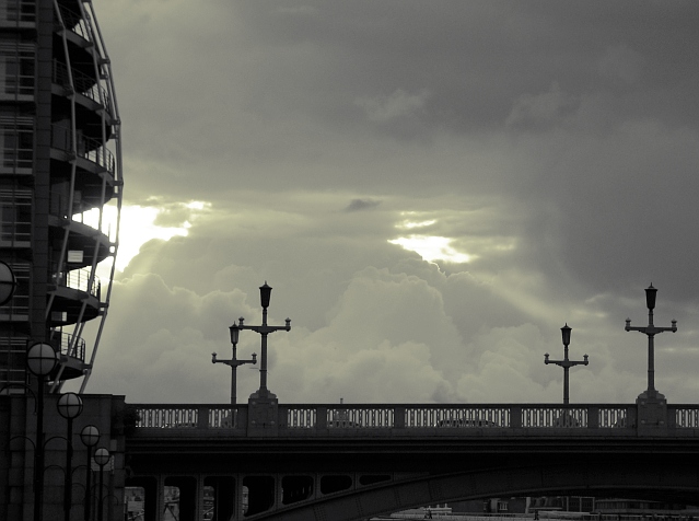
General: Overall I like the choice of subject, clouds. They have a lot of texture.
Composition: This image seems very flat. Unfortunately, due to the tight crop one gets the feeling that the clouds are billowing out of the bridge. More space is required on the bottom and to the right to balance the image. One way to accomplish this is to choose a vantage point that still allows for the photo to be mostly clouds but also includes enough of the bridge to give the image a 3D feel.
Exposure: The clouds could possibly be exposed a touch more to provide more detail. The bridge being under exposed, lacks detail. By using a graduated filter you could have exposed the bridge more without blowing out the clouds. This would reduce the flatness of the image. Using a graduated red filter would both help with exposure as well as with contrast.
Impact: The clouds caught my eye first but there is not really anything to draw the viewer into the image. The bridge acts as a barrier.
Edit now works again.....
I need to check the brightness of my monitor at home. I'm looking at this again at work and you captured a lot of detail in the bridge though I'd still like to see a bit more of it. I will stick with the suggestion of a graduated filter to keep the sky from getting washed out while allowing a slower shutter speed or smaller aperture.
General: Overall I like the choice of subject, clouds. They have a lot of texture.
Composition: This image seems very flat. Unfortunately, due to the tight crop one gets the feeling that the clouds are billowing out of the bridge. More space is required on the bottom and to the right to balance the image.
Exposure: The clouds could possibly be exposed a touch more to provide more detail. The bridge being under exposed, lacks detail. By using a graduated filter you could have exposed the bridge more without blowing out the clouds. This would reduce the flatness of the image. Using a graduated red filter would both help with exposure as well as with contrast.
Very interesting shot. I keep looking at it and I love the ocmposition but think it would be even more striking with something ... maybe more contrast? Lots to look at and very uniique - good job.
this is a lovely photo. it has a very abstract look about it. the only thing i would have done differently is make a little tighter crop on the bottom, but, i think it's great just as it is. good job!
Looks completely natural in a duotone shading, very nice choice. I think maybe just a bit too much of the building on the left shows, as it tends to draw the eye away from the center.
This is a really nice shot. The white background is really a nice capture but then you've also put these silhouettes in front of it. There is some nice contrast going on in this photo. great capture. Nice work.
love the tone in the clouds in this image...... not sure about the building on the left.... I think it might be a little distracting..... good luck, Todd.
oooooooooo. pretty clouds! hmm i'm not sure but overall the pic seems too dark. maybe a different color?
also, i'd crop off the top.. down to the top of the pretty clouds and make it a sort of panorama. i really like the curve of the bldg on the left but all that empty space in the sky isn't helping...tough trade-offs in this shot... the area under the bridge looks too distracting and busy but the diagonal of street lamps on the left is nice.. probably not worth it to show more below but a different composition using the lamps would be nice. those clouds are really cool, but you just have to look too hard to find them right now. not enough light and contrast in them. compared to the other shots i dont think this one stands out... its one of those that you need to look at in order to appreciate.. not a lot of "wow".. no obvious and immediate subject etc. a strong frame might also help
The composition is nice, but i'm a bit worried about those two blown out areas; seems like they dont belong to the photo. I love the puffy clouds in the middle though, great feel for their volume.







 Add photograph to your favorites
 Add photographer to your favorites

 Photographer found comment helpful.


