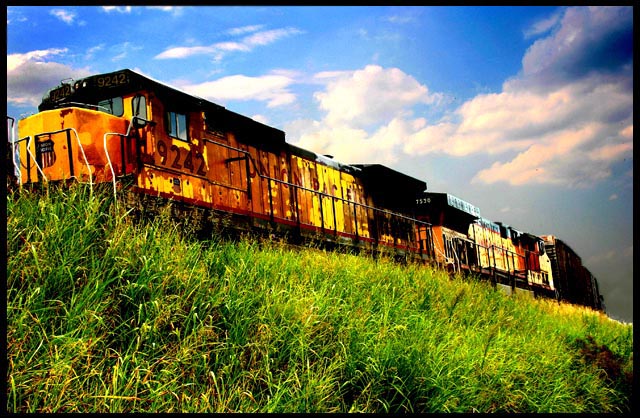
Emm.. wasn't sure about entering this one. I don't think it will do well because I'm not sure this is what a High Contrast picture is supposed to look like. So hopefully I won't do too treacherous.
Statistics
Place: 110 out of 343 Avg (all users): 5.7603 Avg (commenters): 7.2857 Avg (participants): 5.6644 Avg (non-participants): 5.9140 Views since voting: 870 Views during voting: 394 Votes: 242 Comments: 17 Favorites: 0
Well hello there. My first thought on this is the wonderful coloration not only of the rusty train but of the grass and surrounding area. The sky is bright and the blue is a perfect backdrop to the warm tones of the train. Is it high contrast? In my opnion, yes. Blue and yellow are opposite on the color wheel, so the true contrast lies there in my eyes. Green and red are as well, so the rusty brown red of the train is a great 2nd contrast to the grass color. As far as composition, I think you need more negative space - more area on the left of the train as if it has somewhere it's going. It would create a sense of heading toward a distant place. Or if there were space behind it, of having been somewhere else. With that tight of a crop, it boxes it in a bit too much. The lighting and focus are really well done, so with a change of placement, this train has a short trip to make to a great destination!! All the best, Judy
I love the saturation in this shot. And the angle works very well. The only thing I would change is the whole right side of the photo seems dark, from top to bottom. Might be the clouds fault. 9!
Colors look a bit strange, almost like there was some nearly-harsh post processing? Still, I really like how vibrant and alive the scene is. It's very well done! 10
I disagree with the crop, cutting the train on the left and leaving space on the right feels ackward to me. Interesting texture on the engine from the contrast, boy I love trains. Had an engineer stop and offer me a ride last month when I was chasing one. Anyway, great image, 7





 Add photograph to your favorites
 Add photographer to your favorites

 Photographer found comment helpful.


