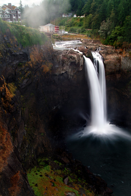
I love waterfall shots and the effect this one gives off at the bottom is very interesting. I think I would like this shot cropped tigher at the top only because the red & white buildings in the middle are distracting. Also saturating the greens/yellows in this would really bring out the contrast colors against the rocks and water. 8
Very cool high contrast on the waterfall and lower 2/3rds of your photo. The top third, unfortunately seems very close in tonal value. Pretty shot, though.
I envy people like you that have a place like this to go and shoot. This is a very impressive shot. Any way to catch an angle to get the facility in the middle out?
The water has quite a lot of drama. Nice range of tones and colors. High contrast? Well, ok, but it would have been a stronger argument if the lodge at the top left were omitted along with the unappealing sky.
I think I've seen this landscape before (but I don't recall off-hand who shot it). Anyway, it's still beautiful. I think you got some great tonal ranges here, but the sky is a distraction. I actually think the image would be stronger with a tighter crop on the top - eliminating the buildings, sky, forest, etc. Still, this is a very strong entry and a shot that I think is beautiful.
I like the waterfall, which has a very strong impact and contrasts very well with the dark surroundings, but i find the buildings at the top dilute the impact, maybe a tighter crop? (i also love the colours in the bottom left corner)





 Add photograph to your favorites
 Add photographer to your favorites


 Photographer found comment helpful.


