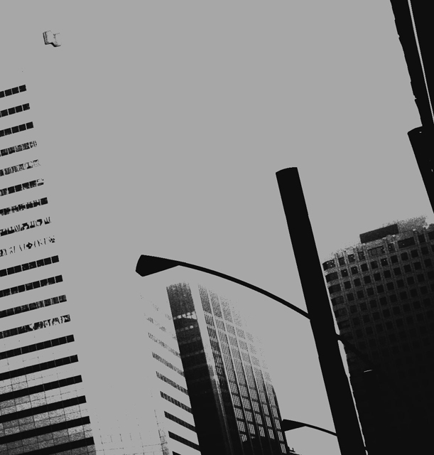
Another image in this challenge that I really like. It instantly reminded me of the New York images that Walker Evans took. Love the tones and composition. 7
the style doesn't bother me, I like photos reduced to graphic elements - but on this particular photo, it leaves us with a black rectangle jutting into the photo - the pole becomes the main focus for me - I'd like to have something more interesting to see as the main element - neat effect though
Although the buildings are clearly commercial in some way or another, without the title there's no indication in the photo to define them specifically as banks. It seems more like a shot of the lamppost I'm afraid.
This is an amazing result using basic editing rules. It's the kind of thing you could see as a full page watermark in an annual report. In that context, you could selectively correct some of the areas that can't be fixed under these rules. Full marks for the style and feel of this, maybe 1-2 off it for being maybe just a little too abstract when showing either the bank or branch. Without the title it's not posible to make the connection - 7
I love the concept...what could be better than a blown-out bank?.... I think the composition detracted from what could have been a very powerful image.
Good take on the idea and i love the black and white effect. But to me because the rest of the building isnt showing it seems like something is missing and that the picture isnt full enough
i really wish that the bank had been more visible. the focus of this photo is the lamp post. i really like what you did to the photo though. the lamp post takes over the photo.
This picture just seems to bland. Nothing very eye catching, and even if so a bank is in itself pretty boring. It may also have people running away subliminally. Banks strike all those negative feelings of debt, power, and social demise. To me anyway. GL







 Add photograph to your favorites
 Add photographer to your favorites


