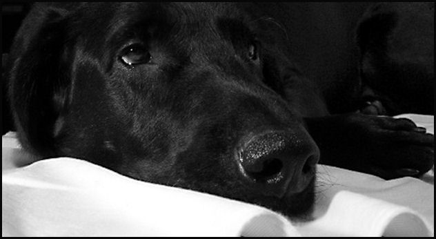
Awww, I'm a sucker for animal shots. And this one is no exception. But sadly, I don't see a lot of contrast in the overall shot. While you have the white blanket and black dog the "pop" factor just isn't there. Maybe if the contrast was bumped up just a bit more to really bring out the difference between the two? There is to much gray in the white areas to really hit the spot for me.
Otherwise, I love the composition of the shot, the look on his face is priceless and the cropping, while nice, could maybe come in more on the right, taking out the paw area, leaving more of the face itself.
Saw your post..so here is my comment..the dog is very cute, I like his eyes, and he seems to be in focus. With a neutral background I think it might help if you made sure it wasn't in the foreground..it becomes distracting...maybe it would help to try catching the dog from up above, so that the background becomes less apparent (and it would still fit the challenge).
Sure does look like a nice dog...hope any of this helps.
There is something that I don't like in this photo. to much of distracting things like the waves on the white thing, and seeing two feets not lying like I would like it to be ... but this is just my 1 cent.






 Add photograph to your favorites
 Add photographer to your favorites

 Photographer found comment helpful.


