*Critique Club*
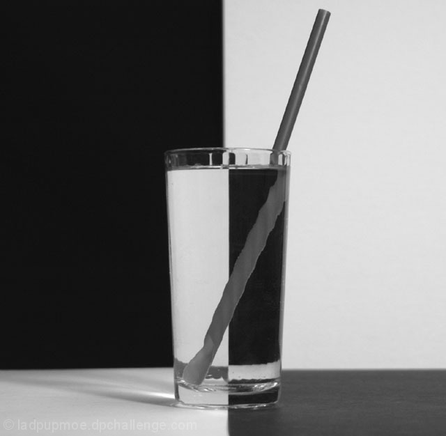
Well, The verticals are vertical, but the strong horizontal line in the back is not horizontal. The is a bit of a tilt/curve in the 'horizon' there.
I don't particularily care for the straw. It's being all distorted by the ridges in the glass. Also, you can see the ridges at the top of the glass.
I think that this would have a higher visual impact on me if the glass was a solid glass, or if the straw was just not there. I realize that the straw was added to make this shot not 'boring' however, I think it has a negative effect on the photo as is.
The focus seems a bit soft, but I'm wondering if that is because of the wavy ridges in the glass as well. Most likely hard to capture becuase of the textures.
The angle and framing/cropping (with the exception of the tilted 'horizon') is good. I think being centered is important for such a symetrical shot. And the horizontal line IS placed in a nice spot within the photo.
I do think that this is a bit grey though. Would like to see the whites white.
Overall a nice shot, with some few minor adjustments, this could be great.
~Heather~
An interesting take on the now well-used refraction trick. The whites aren't quite white though, unless by the title you just mean the shot has been converted to greyscale. I find the corrugations in the glass detract from the shot, as they make the straw look chewed (the scoop on the straw doesn't help either, IMO). The light shadow to the left of the glass disturbs the symmetry too. I think the composition is pretty good otherwise, however. Maybe with some level adjustments and a darker piece of black cardboard, it would be more punchy. Now that I look at it, you can see the cardboard coming up a bit at the bottom of the shot.
Hmm, honestly I think I would have liked this better withOUT the straw. The refraction just looks very odd, probably the more so because of being in B&W -- it actually looks like a separate object completely (including in that it looks like a Twizzler underwater).
I wouldn't have chosen this sort of a glass for this picture because of the lines its creating with the straw. Also, I wish the whole image was a bit sharper, but fun effect.
Very contrasty, which is sort of good, but the very flatness of the tones makes it look more like an abstract painting (in chunks of solid color) than a duotone or nuanced photograph. Also, the glass, straw, and bottom drape are all just enough out of focus to be kind of annoying ... to me. Personal taste. :-> 6.
Good try, however. I can see the bevels on the side of the glass since you didn't fill it to the top. Your posterboard (I guess) lifted up in the front. The back line is a little blurry. I guess it is harder to re-produce in B&W
Nice idea. I like it, though I think it could benefit from some contrast enhancement and some unsharp mask. Also, the table appears to be tilted to the left. This might be the result of barrel distortion, though. Still, nicely done.






 Add photograph to your favorites
 Add photographer to your favorites

 Photographer found comment helpful.


