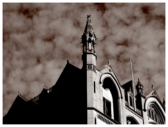
I'm not sure which means you used to get to a duotone but this doesn't look like I would have expected it to. The deep brown in the sky is very nice but the brown is either absent or barely there in the architecture. The lighter midtones hold almost no colour at all while the darker ones on the right side of the picture have fairly saturated browns. I will be interested to see exactly how you did this.
I suppose "yowza!" isn't very constructive... :) I love the contrast of textures between the clouds and the architecture. Generally not a fan of straight-on symmetry in composition, but I think it works okay here because of the subject being both clouds and building. The lower left going to full black might hurt this photo a little -- would love to see the entire field shifted to the right a bit, with less black, more of the facade, and the turret just inside the 1/3 mark. Overall, I love this photo!
Good composition, nice detail on the buiiding, but although the clouds are unique, I find them distracting in this case (seem a bit out of place to me).... That aside, well done!
dramatic angles, vivid lighting, gorgeous sky. You took advantage of a great subject and environment, and did an excellent job. I might have cropped after the first arch on the right of center - the other arches and architectural details are a bit much, and distract the eye away from the tower whereas the black silouette on the left leads your eye up to it. 8
This is a really great shot. I personally love duotone shots, and medeival looking architecture. Composition is really nice, as well as the texture of the clouds in the background. Great looking shot.
Awesome contrast from the left to the right side. Love the separation and layering of the church, it looks like it was cut out and stuck to an underexposed layer of batting. I would've like to have seen more of this church, but I'm sure that some of the layering would be lost by moving the focal point of the camera back toward the lens. Excellent shot. I originally gave this a 7. Today I see it as an 8.
What a superb sky and an elegant face to this - the one side is SO dark, however. It would be perfect if I could see just a touch of detail on this side and the right wasn't quite so blown out - too much contrast here. 9
The sky tone against the clouds is rather distracting, which detracts somewhat from the shot of the building itself. Looks a bit unnatural, like the building was placed against a different background. The angle on the building vs the lighting is, however, absolutely perfect.
wow! this really jumps off the page.... love the high contrast and the effect it has on the building and the sky!
Great image! Good luck, Todd.
Been back to look at this several times and think it is a great image..... gave you a 9 but on review it's getting a 10..... really meets the challenge and creates a real mood.







 Add photograph to your favorites
 Add photographer to your favorites

 Photographer found comment helpful.


