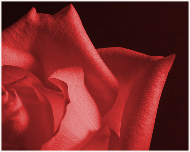
Tried Mr. Setzler's tutorial on sepia toning a photograph. I wasn't happy with the yellowish brown tint of the sepia toning. Fiddled around with the hue and saturation sliders till I came up with this red version I really liked. Hope you all enjoy it too!
Statistics
Place: 36 out of 147 Avg (all users): 6.1870 Avg (commenters): 7.1429 Avg (participants): 6.0444 Avg (non-participants): 6.5758 Views since voting: 1414 Votes: 123 Comments: 15 Favorites: 1 (view)
*Critique Club*
I'm not really sure if this is considered duotone or not. I'm not educated in that area enough to decide. I does not LOOK to me like a duotone. It looks like a full color image that consists of 2 colors. Seems to be the same thing, but I don't think it is.
Oh well, setting that aside, I think the image itself is great. I don't see any true black, when you lighten up the background, it's actually a really dark redish color. I tried this shot in black and white and really like it also.
your focus and clarity are what make this shot great. You show us some really neat detail in the petals of the rose. it is a perfect rose, no flaws, althought I don't mind seeing flaws either.
The angle and framing/cropping are good. I like how the one triangular petal sticks out into the shot. Very visually appealing this way.
I dont really have any suggestions for improvement on the shot, unless it's not duotone, then there is the obvious one. However, still good.
~Heather~
First impression: That can't be a duotone, it looks too real! Second impression: If there really is only one hue of red in there, then WOW! In any case, great crop and lighting. Even better if the DOF included the closest petals...






 Add photograph to your favorites
 Add photographer to your favorites

 Photographer found comment helpful.


