I didn't get a chance to vote in this challenge, life and all that but had I had the chance I probably would have given this image a 5 to start, possibly a 6.
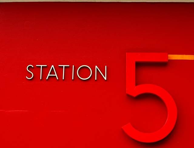
I like the idea but the overpowering red in the shot overshadows any contrast the white STATION might have offered. Also the 5 itself seems a it out of focus, not sure if that was intentional, trying to keep the focus on the STATION but with it being such a large part of the image it's a bit distracting to me.
Also the orange line leading away from the top part of the 5, while a nice way to lead out of the shot doesn't really work for me, again it's competing against the STATION, and my attention is all over the place as a result.
This is really cool. Love the vivid color tones. My only minor criticism is that it's off horizontally (just a bit, but still noticeable). Otherwise, great entry.
Cool idea. I like how the white really stands out. I think that this shot could maybe benefit from a tighter cropping. Especially at the top, the frame or bar, or whatever that line is across the top seems to really take a lot away from the image.






 Add photograph to your favorites
 Add photographer to your favorites


 Photographer found comment helpful.


