Author Thread Comments Made During the Challenge
Post actions
Great title! I wish the "new guy" wasn't cut off though.
Post actions
Post actions
Too bright for me - it makes it hard to distinguish or differentiate items in the pic.
Post actions
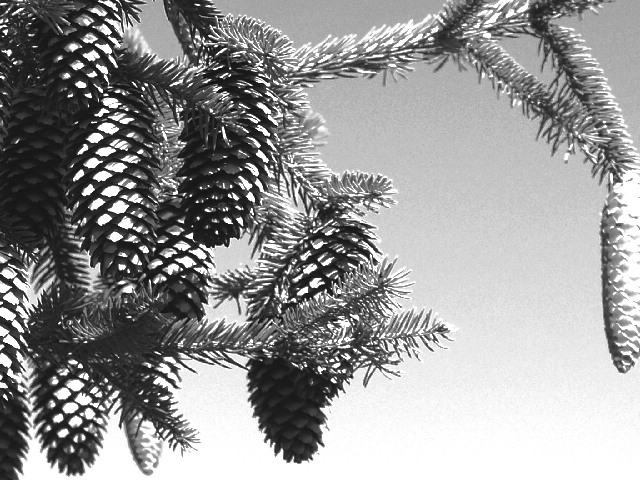
The pine cones take on a distinct quality in high contrast. A bold approach.
Post actions
cropped too tight, and the the flatness of the b&w would be much improved with the vivid colours I imagine are in the sky, leaves and pine-cone considering how strong the sunlight seems to be.
Post actions
The message is cute. I would prefer less of the processed look.
Post actions
Cute, but would have liked to see this in color
Post actions
could have been an entry for high contrast as well, but for this challenge I think it is too over exposed for me and there is too much 'going' on in the composition
Post actions
I like the composition, but not the lightng.
Post actions
This is a great picture. I'm curious if color would have complimented it more.
Post actions
a bit bright.. I like the way the light shows the textures off.
Post actions
Very cool idea! I find the heavy processing a bit distracting. 7-1





 Add photograph to your favorites
 Add photographer to your favorites


 Photographer found comment helpful.


