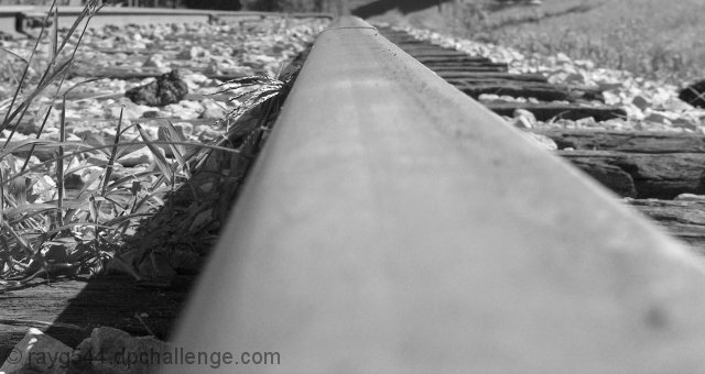
This was taken at the Clarksville Train Station the same day I took my shot for the "High Contrast" challenge. Just cropped and desaturated. I originally cloned out the grass blade crossing the track, then realised this is basic editing.
Statistics
Place: 221 out of 432 Avg (all users): 5.0300 Avg (commenters): 5.7692 Avg (participants): 4.8581 Avg (non-participants): 5.1974 Views since voting: 912 Views during voting: 402 Votes: 300 Comments: 17 Favorites: 0
I must say that this is one of the most unusual perspectives for a railway shot that I have seen. I do think that unusual perspective helped keep your score above 5.
The black and white conversion is good with tonalities going through full black to full white across the picture.
A few things that would help this picture:
1. DOF choice: In a shot like this with the one STRONG line leading through the picture, it would be better to start it out tack sharp and let it then fade out as you go through the picture. The line should produce the dynamic movement through the picture. Here, when you look at the picture, the eye has to struggle through the out of focus at the bottom of the picture to get to the part that is sharp.
2. Focal Point: Where does the leading line lead me to? What am I supposed to be looking at in the picture? Especially in this as a black and white photo, I need something to be looking at, and not just the line (the track) leading me through the photo. This also relates to the choice of DOF, as I get to the tack sharp point and want to be able to look at something there, but nothing appears and my eye wanders right off the top of the photo without being able to stop and 'rest'.
3. Clutter/Background: You already noticed some of this as in your comments, you had cloned out the grass blade and then noticed it was basic editing. What would help in this to start off with is to just go and pull the grass from the track before you take the shot, then you don't have to worry about it. Look at the background and ask, "Is there any way I can remove distractions from the background before I take the photo?"
4. Crop: Most photos of railway tracks are done in the vertical/portrait orientation rather than horizontal. A vertical/portrait orientation gives a sense of distance of the track seeming to extend to infinity and beyond. With this orientation in the photo, there is a sense of truncation, of stiltedness. There is too much space to the left and right of the track for my eye to drift back and forth.
Overall Impression: While I did not vote in this challenge, I would have scored this picture a 4. Removing the distractions from the background would bump it up to a 5. Correcting the DOF/orientation would possible bump it up another point to 6. I do think that your conversion to B&W is very good and your eye for a different perspective is commendable as well.
If you have any questions about this critique, please feel free to contact me via the PM system.
Without the title there's no indication that this is a branch of the railline. A junction would have made this reference clear for the viewer. A different approach but could have been more clear.






 Add photograph to your favorites
 Add photographer to your favorites

 Photographer found comment helpful.


