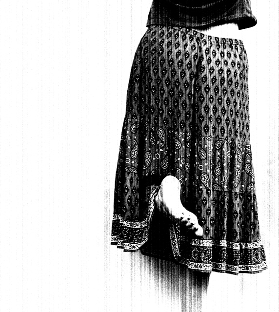
I was stumped after being sick all week and suddenly I thought of this cool peasant skirt I have. I draped a light blanket over the fence and stood up on tip toe with my left foot up and behind me and reached up, so that my arms would pull my shirt up. After cropping,I went to grayscale mode and then adjusted bright and contrast and applied a vertical grain filter. I really like it. I might get slammed because it isn't crystal clear, but that's the exact reason why I like it.
Statistics
Place: 29 out of 343 Avg (all users): 6.2551 Avg (commenters): 8.0000 Avg (participants): 6.1667 Avg (non-participants): 6.3918 Views since voting: 3824 Views during voting: 407 Votes: 247 Comments: 66 Favorites: 55 (view)
WOW .. this is so excellent judy .. was choosing it for pik your fav pic but spent too much time in your wonderful portfolio and missed the train .. lol .. !! ..
This is kindof a bizarre cross between peasant skirt meets the matrix with those background lines, which is good becasue I think it wouldn't be nearly as interesting if the background were pure white. I also really like the tones on the skirt, I just wish the highlight on the foot wasn't quite so blown.
This image as been in my favourites for a few months now and I still like coming back to it at enjoy the way it portrays an everyday action. Not only did you take a pleasently different approach by cutting off the image just above the hips, thus leaving the action of reaching which one usually associates with stretched arms, out of the frame. You also managed to give it a very charming quality with your high contrast post processing. What really did it for me, I guess, is your use of vertical noise to echo the upward movement of the model.
This is a really great image; youv'e got such a great control of teh blacks and whites; with that nice contrasting fence below the foot; the detail is excellent- the pose, the pattern on the skirt; again- great shot.
I'm having fun looking through your portfolio and had to comment on this one. It's just the "important" elements with all else blown out. Your critique club commenter is spot on. In both the images I looked at you used a filter (perhaps not usual for you?) with an artist's touch - they compliment and enhance the message. Thanks for entering this one.
This is a good time for me to mention that I really like this picture as well. It breaks rules with elegance and sophistication in a way that blurs the line between photography and graphic design. That is most excellent.
Great contrast, composition and subject matter. All works well with the style of the photograph. In retrospect, I should slow down when voting, I think I should of scored this one a even higher. Love the originality, keep up the good work.
Well look who's photo I get. :) I saw this one during voting and really liked it. I'm not sure what really it is that I love about the shot, but I think it's the sheer simplicity of it all. Dark shirt and skirt and light background and skin. I think it really works for the challenge.
The pattern on the skirt is pleasing and I love how you placed the subject to the right of the photo leaving the negative space to the left. I think that works really well here.
The lighting is perfect for the shot as well as the challenge. I think that the darks are perfect, and the whites are also perfect. Great contrast and nice range.
Focus and clarity are also right where they should be for the feel of the image.
I like the vertical grain filter. I'm not usually a fan of filters, but this one is so subtle that it looks like it could have came right from the camera itself.
I really do like this. My only nit pick is that we can't see the other foot, so it almost looks like it's been cut off at the bottom, although one can assume that the foot is just covered by the skirt, it also doesn't look like she's standing on anything, so kind of hovering. Still an A+ image. Great job.
~Heather~
Oh Judy, this is AWESOME!!!! I missed this whole challenge being out of town, but I would have scored this one in the top 10 without a doubt! You rock!!!!!!!
Nice job. I did not comment on this during the challenge but I did rate it high and went back to it multiple times to figure out just what I like about it. Emotive is probably the right word. Congrats on 30th.
I thought (and still think) that this image was really a refreshing change from the norm and an exceptionally well-thought out and executed shot. So glad to see that it's yours!!! Fantastic work - congrats on your top 30 finish! (I expected that it would finish much higher.)
Nice pose and composition. I don't like the 'wind' effect without burning elsewhere in the white. Might work better in sepia. Maybe also a little more shadow. 8.
This is so perfect, I love the mood that the B&W and slight vagueness have created. Good use of white space (composition/crop) to make the right have more impact. The appearance that there is a foot sticking out with nothing to support it all is weird and great. :)
I love it, 10 and fav (already added it wednesday or thursday).






 Add photograph to your favorites
 Add photographer to your favorites

 Photographer found comment helpful.


