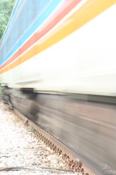
COMPOSITION I like the composition. You're close in on your subject, the frame is filled, and you have great lines running diagonally through the frame with a dramatic perspective expansion toward the right. I might have cropped off the cables visible at the bottom. I'm sure your choice of subject left some voters saying "huh" as far as the challenge was concerned.
TECHNIQUE I see several problems here, which if rectified, would have made this a much more eye-catching image. The whites of the train the stones at lower left are overexposed and have lost much detail. The colors in general seem a bit washed out and low contrast. Since you were already at f36 (!) you might have gone to a slightly faster shutter or even thrown a ND or CP filter on the lens to knock down the light a little more. The colors seem muted and pastel. I would have worked to bump the saturation of these colors and might also have shifted the hue a little to really make them pop. Also applying a curves "S" will help with the contrast and the tones. Finally, maybe a dramatic USM adjustment with 40/100/3 type settings. This doesn't really sharpen in the traditional sense but helps boost the tones.
OVERALL IMPACT This is an image that had significant potential but suffered from some technical shortcomings that prevented it from standing out in a large, crowded challenge. You have a great eye for composition though. Keep shooting and keep experimenting with the longer exposure stuff, and don't be afraid to really work your images over in post-processing to bring out the potential.
Wow! That must have been a little un-nerving. It is a little hot. I wonder if some level adjustment or exposure compensation might have given more contrast.
I dont think the technicals are too bad here, it just don't appeal to me. Im not a fan of the colors, and the picture comes across dirty. By that I mean the sky looks polluted in the upper left, and the twigs and limbs make it look dirty at the bottom. Of course there is a time and place for dirty, I just don't think it collaborated well here. I hope my comments help, I don't mean at all to be over critical. GL.
needs contrast. good lines and comp. adjusting the saturation to bring out the colored lines would have helped too. if you're going to blur teh subject, get the background in sharp focus. This would have been such a great shot with a little more effort.





 Add photograph to your favorites
 Add photographer to your favorites

 Photographer found comment helpful.


