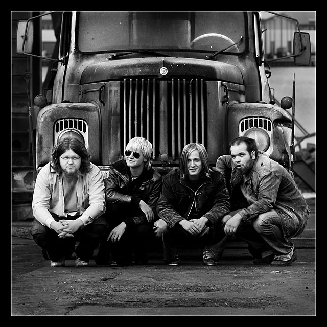
Selective curves mostly on adjustment layers, b&w convertion with channel mixer. Got more contrast with selective color by boosting black, white and neutral "colors".
Statistics
Place: 8 out of 343 Avg (all users): 6.7236 Avg (commenters): 8.1667 Avg (participants): 6.7075 Avg (non-participants): 6.7475 Views since voting: 4186 Views during voting: 410 Votes: 246 Comments: 42 Favorites: 12 (view)
Thank you for this very helpfull critique, I totally agree with you there. The faciall expressions are not as strong as everything els in this photograph, an yes you are right, I have a bunch of shots of them in this position. I´m going to look at them a few more times and see if I can find a better facial expressions, its a must!
Once again, thank you very mutch, I put a lot of work into gaining thins look.
Critique Club
WOW!!! I love it! Do you really need a critique, I am sure you already know it is great. The tones and contrast are perfect especially for the subject matter. I love you location and crop, it is just perfect. However I will be nit picky on a few things, mostly facial expression. You have pulled everything else together so wonderfully I can't help but wonder if you have another shot in the bunch that has the right expressions. (This is only my opinion) The guy with the glasses is perfect! The guy on the other end looks like he is mid sentence and it doesn't fit well with the other expressions. I would have liked either all of them looking or all of them doing their own thing. Having two looking at the camera and two in their own work does not work for me. I do think expression can make or break a photo, this is so well executed that I don't mind much, but I think it could have been even more wonderful. Great job!!! By the way, I don't think you need such an extensive border and think black line would look very sharp
I just scanned through the entries, and I am pleased you got in top 10 as it really caught my eye.
Are they a band, or what are the guy's connection with each other?
Well done
Sorry, just discovered the comments below. I am just learning the system.
Thank you all very mutch for the comments. I decided on going for a high contrast theme, there for this challenge was really suitable for this photograph I took for my friend and his band. I am really prleased and greatfull with finishing in the top 10.
A great B&W with interesting subjects and background. The overal feeling is that is a bit too posed for the mood the boys are trying to express. Subject placement works well for an album cover. Enough room for titles and stuff like that. 7
this picture is technically excellent in every way--composition, lighting, exposure, focus--but my reaction to it does not exceed disinterest. it feels emotionally sterile
Oh My -- I want to see them perform!!! Great Shot. More truck and less asphalt (a style trade I would have made), but you did an amazing job with this one. - 8 -
Excellent framing for a wonderful Album cover. Detail is crisp and clear and you fit the theme of the challenge dead on. A lot to look at here, ive been back several times. Score - 9.
Something about this image I thoroughtly enjoy. Might be the tones. The symmetry and frame bother me but not to the point of distraction. Very well taken. Like the use of lines and curves. Well done! 8
Great composition, very nice and crisp black and white. Focus is excellent as is lighting. Quite a bit of interest with the band and the truck. Nice use of contrasts. I gave a 7.
This is one of those occasions where I think the eye contact "rule" would definitely improve the image - I think it would be more striking if all members of the band were looking directly at the photographer. Still works reasonably well though.






 Add photograph to your favorites
 Add photographer to your favorites

 Photographer found comment helpful.


