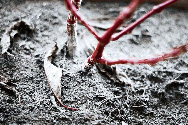
Too closely cropped and poorly positioned losing most of your subject off frame causing a poor composition. The desat picks out the red colour, but seems excessive (just for the sake of using it) and the branch would probably stand out well on it's own anyway since it's quite a striking red. The focus is terrible as well, considering the red branch is the only thing you want focused it's just plain sloppy to lose most of it.
I really like this photo because the first thing that I see is the red tree branch. I like how everything else seems dull and then the tree branch is red.
it's kind of blurry.i'm not sure i like the angle on the picture.i like how everything else is dead and the branches are alive...sort of...but...it's a 7





 Add photograph to your favorites
 Add photographer to your favorites


