hey. you got screwed. seems like a lot of people didn't think this met the challenge or they just don't like this sort of artistic thing. I thought it was very well done and I liked your post processing. Keep up the good work.
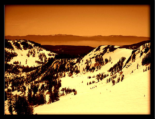
That's a cool shot, but to me all the snow looks yellowish/orange. Was that deliberate? It has a warm feeling to it, and the "glow" in interesting. Not sure what effect you were after, though.
nice capture, I like the tones you've chosen. Not high on the border, I think its a bit thick for the photo, but I love the old, hand done feel of this.
oh, i will, i will. great colors. perfect shot for a postcard or brochure (as you know). I would like to see this in full color because the golden snow throws me off a bit. Also, the feathered edges, and especially the visible line that looks blue on the left side and the one on the bottom right are pretty distracting. 9
A very vivid pict. With these deep tomes, this photo looks almost like a graphic. I like the range deep rust to pale amber. The great swaths of white call out to the skier in me. The fram you chose doesn't add to the photo - I'd like just a plain, thin black or brown edge. I like the composition with the dark mountains in the middle, and down from that the diagonal sweep of the small foreground valley. I might have cropped the bottom of the frame where that diagonal meets the left edge. Very enjoyable. 7
Classic, and nice looking. I like the tone you picked for the Duotone. Very nicely done. I would maybe have tried to level it off slightly, it looks like th scenery is just slightly tilting to the right. Maybe thats just me though. I like your composition. Good luck! -8-
This is a very nice shot but I slightly question your choice of tones, because I'm afraid the first thing I thought was "Don't you eat that yellow snow". A less intense tone might have been better.
thought the border is supposed to be simple. Interesting image, however, not quite sure it'd qualify for duotone in the traditional sense, as there is a clear separation of tones (rather than two tones throughout the whole image).
Seems just a bit overdone to me. It certainly looks like a beautiful landscape from an incredible vantage point, but I can't help but think that it looks like there was some sort of nuclear testing going on nearby :)
interesting duotone... beautiful landscape as well... The only problem I have with this image is the tone chosen for the duotone... It seems to be in direct conflict with the scene. The warmer sepia gold/orange/yellow tint doesn't seem to work well for the cold snowy scene for me... = 5
Hmm. The bad thing about the tone you've choosen is, it sends a mixed msg of what the pic is about... warm colors but a cold subject. :( You should have used a slightly blue tone instead.





 Add photograph to your favorites
 Add photographer to your favorites


