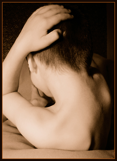
I had Isaac pose in a modification of a cliche nude pose, using a light-colored blanket as background. He only had stamina/patience for about six shots.
Lit by a single incandescent bulb over my left shoulder; softness is probably partly due to camera shake, but I found it acceptable. Three passes with a light setting of USM to try and get some detail in the hair without banding in the skin -- harder to get good results with low-res images.
Duotone using Black and PMS 143, an orangy-brownish color. The original has (to my eye) quite a similar look -- I plan to post a link for comparison after the challenge.
Statistics
Place: 74 out of 147 Avg (all users): 5.6800 Avg (commenters): 7.0000 Avg (participants): 5.6559 Avg (non-participants): 5.7500 Views since voting: 1957 Votes: 125 Comments: 10 Favorites: 0
*Critique Club*
I will say, that when I first read the description, I was quite put off by this. I know that Isaac is quite young, and reading "cliche nude pose" really set me back a few inches. HOWEVER, after than initial shock, my eyes opened up to read the "modification" part, and actually look at the photo, and see that "cliche nude pose" really doesn't fit into the description much at all. This is tastefully done. Had it reminded me of the 'cliche nude pose' I might have looked differently at this. However, it does not.
Ok, that being said. I'm running around trying to find a crisp focus here. I have a feeling that it's on the flat part of his back, which you really can't tell if it's sharp or not due to the simple plainness of it. The next part I see that looks more crisply focussed is the hair on the back of his head. I think I'd prefer his entire back and hand/arm to actually be in focus here.
As I look at this, my eye really is drawn through the hole created by his arm and right down onto the foot, which is perfectly positioned in that hole. It's kind of like a spiral effect. From his back, to his head, down his arm, from hand to shoulder, and then into the center where the foot is. lol
The lighting is nice dramatic lighting, however, a bit harsh on his ear and shoulder. I like the darkness on the one side, and think that it's quite effectively used to create some nice shadow there. I wish you could have spread the shadow onto the area of floral carpet we can see in the background. :) Otherwise, the light cloth works great.
I have never tried using PMS in my favor while editing shots. LOL But that's a whole different discussion. I think that the sepia-ish tones work here. i'd be curious to see this in black and white also.
~Heather~
and it was an excellent study. Looks like you accomplished what you wanted to. Great composition, form, tone, lighting, etc. For some reason i would have liked all of the thumb to be lit, but im being very picky here. I like the golden hue for the skin and the lines of the back and shoulderblades really position the body well in the frame. It is soft and lovely, 9
I guess I don't get the form part to this picture. I think it's about an 8 to 10 year old boy judging by the hands. Maybe a little older. The tone is pretty good. But the form part makes me wonder what the photographer was trying to accomplish in this shot. It looks like half a sit up, or someone just clunked him on the head. There's not much flow to the form, the framing is too tight and his elbow has bent right off the screen on the left side.
IMO the light is too harsh washing out his ear and shoulder. also a confusing pose with his foot being the focal point of the shot. At least I am led there. 5








 Add photograph to your favorites
 Add photographer to your favorites

 Photographer found comment helpful.


