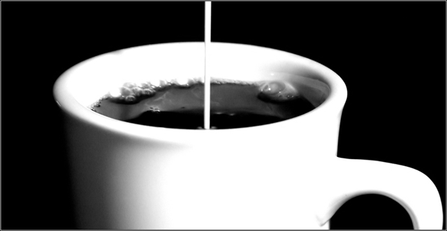
Nice simple image. I like the format, and the reflectio on the inside side of the cup. The cup doesn't quite seem horizontal to me. Could be my eyes tho! 8.
Fit Challenge Criteria: 2/2
Color/Contrast: 1/2
Composition: 2/2
Photo Quality: 2/2
My Subjective Affinity: 2/2
Nice work. It is coming out a little blown out on my computer, but I know my monitor doesn't display as well as my home monitor, so I'm giving you the benefit of the doubt. This is an excellent frame.
simple and meets challenge well. I like the layering of "contrasts" white on black on white on black. Seems a tad out of focus to me and the whites in the front of the cup and the handle seem a little over exposed. But overall a decent submission.
Nice take on this challenge.
Simple & effective.
Only suggestions to improve it would be a little sharper and perhaps not so centered.
The actual pouring portion of the milk is ever so slightly off true vertical also.






 Add photograph to your favorites
 Add photographer to your favorites


 Photographer found comment helpful.


