Author Thread
10/29/2005 11:43:16 PMPost actions
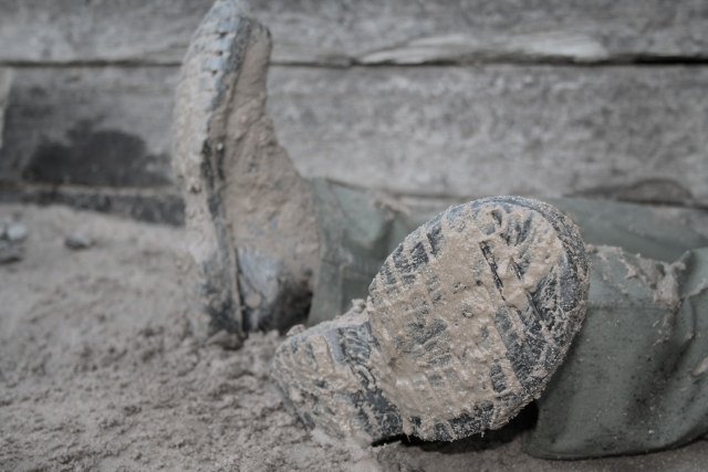
Once again, more contrast would do wonders to bring more life to this shot and bring out the textures. I would also like to see a bit more room above the top boot. This is a neat kind of shot because it tries to tell a story and makes the viewer wonder. Good subject, just needs a bit of tweaking to bring out the possibilities.
Comments Made During the Challenge
09/06/2005 11:50:53 PMPost actions
like how the mud gives character
09/06/2005 01:59:51 AMPost actions
Not enough contrast. A little gray and hard to distinguish. 4
09/04/2005 03:48:21 PMPost actions
Hmmm..Evokes a disaster....beyond fatigue. Emotional. 9
09/03/2005 10:33:33 PMPost actions
I like the idea, but I wish both boots were in focus and perhaps cropped just a little bit tighter on the left hand side.
09/03/2005 05:47:33 AMPost actions
Nice idea, but the colours are a bit dull. Maybe it would have worked better in B/W with a bit more contrast.
09/03/2005 12:34:27 AMPost actions
This one's on the verge of slapstick humor. I like it!
09/02/2005 10:10:47 PMPost actions
not enought contrast - the shoes and background blend together too much
09/02/2005 04:02:54 PMPost actions
too much blending of objects and background
09/01/2005 06:44:53 PMPost actions
the way this photo is shot looks as if the feet and legs are coming out from underneath the building. is someone sitting against the wall?
09/01/2005 03:03:43 PMPost actions
The col0ours are all so close in this image that they blend together. The compositoin is okay and the DOF is really nice, but the dull browns and greens pull down the image. Crank up the saturation or desaturate competely and fiddle with the curves to give the image a little more bang for the buck.
09/01/2005 02:51:04 PMPost actions
This photo seems too staged but like the simplicity of it
09/01/2005 10:57:52 AMPost actions
Colors are dull and washed out, but pose, lighting, subject are all very nice.
08/31/2005 09:10:54 PMPost actions
Fantastic idea but possibly missing a dramatic tilt. Maybe DOF to get both boots, higher contrast or added light ... not sure - 4
08/31/2005 08:52:08 AMPost actions
This almost has a camouflage sense to it. I like it. The monochromatic theme works.





 Add photograph to your favorites
 Add photographer to your favorites

 Photographer found comment helpful.


