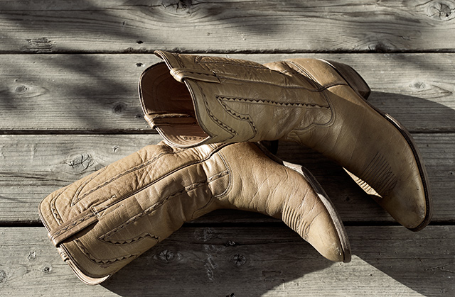
Didn't vote this challenge -- would have scored this on the lower side as I'm not connecting to the subject or form somehow. Disecting this a bit it could be the central composition? the placement of the boots? Maybe I'm not a cowboy boot fan?? ;)
A more original approach, maybe trying to say something to us about those particular boots, would be better. composition-wise, the space above the boots is uneven, and you could maybe have included more (if not all) of therir shadows since the low angle of sunlight is dominant in the picture.
Fit Challenge Criteria: 2/2
Color/Contrast: 1/2
Composition: 0/2
Photo Quality: 1/2
My Subjective Affinity: 0/2
The straight down angle for the boots isn't the greatest. I would have tried a much lower angle, and made use of shallow DOF also. This one is just too plain.






 Add photograph to your favorites
 Add photographer to your favorites


