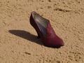
The effects are unnecessary and distracting from the textures which are suppossed to be the subject of the shot. The composition also seems awkward. Why is there one shoe facing the opposite way?
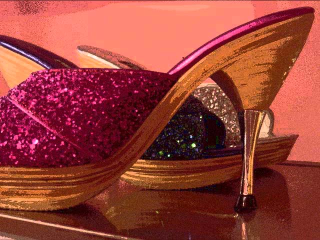
this image has a lot of appealing motion in it. the high contrast treatment really accentuates all the lines. if the image were cleaner--less pixellation, more smooth divisions between color areas--this would really be good. 6
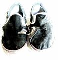
It looks as if you applied a filter to get the brushed look of the image. It seems to work with the shoes okay, but I find that the background is distracting. I know it is basic editing and you can't spot edit, but if you want to get a really nice image (for sale or something) I would clear the background of the spotting and have it plain. Good interpretation of the theme, however.
Interesting picture. Too grainy for my taste, and the grainy-ness kind of dulls the 'sparkle and shine'. (Also makes the photo look a bit unrealisitic and more like a painting) Your idea is good though, and the colors are nice. Can't say too much about the lighting since I can't really tell but it's creative.
I don't care what you did in the pos processing but I can say that I don't care for it at all, waaaayyyy to grainy and flat for my taste. Just wanted to tell you why I gave it a 3, and only reason why I didn't vote lower is that it's on topic. However, if you like this shot, stick with it, after all, this is just my opinion and opinions are like assholes, everyone has got one...





 Add photograph to your favorites
 Add photographer to your favorites


