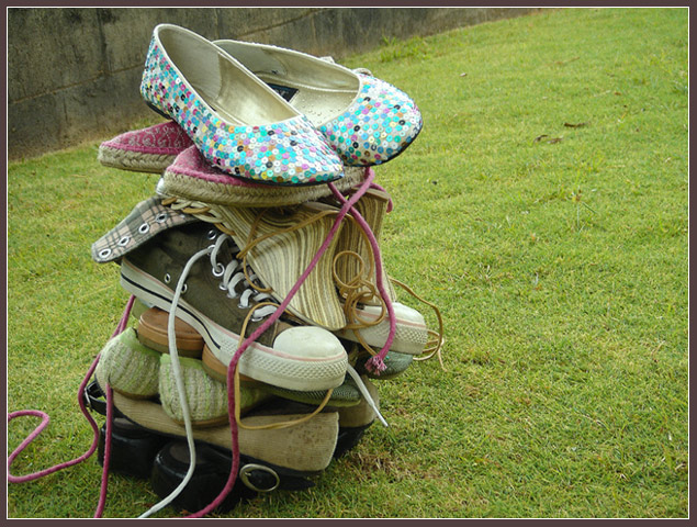
There's shoes in it, but they're out of focus, they're badly composed especially annoying is the wall in the background. And why the lawn as a background?
Clever idea, interesting too. Although I think it might've looked slightly more interesting if the tower of shoes had been leaning more to one side. (Is it? I can't really tell) The colors are fine, but it might've been nicer if they were brighter. Original though, kudos to that.







 Add photograph to your favorites
 Add photographer to your favorites


 Photographer found comment helpful.


