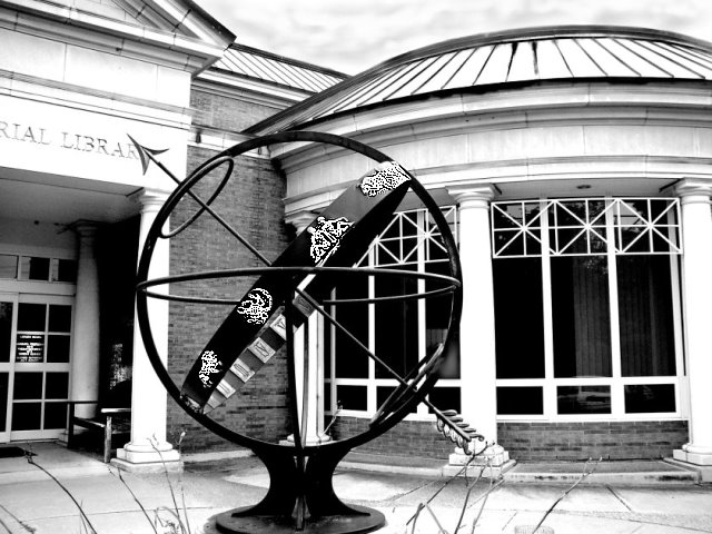
Exposure Compensated -0.5 steps. Set the camera to high contrast, normal sharpness. Deactivated flash. Used spot metering. Post processing - Changed photo to black and white and adjusted the green to darkest, red to midtone, and blue to lightest. Dodged and burned in the sky, dodged the detail of the zodiac relief patterns and sharpened them as high as I could. Adjusted contrast further to become even darker and lighter. Spot edited the building lines to reduce noise and increast darks. Dodged detail around the sculpture over in lower right to separate it from the blackness of the window behind it.
Statistics
Place: 200 out of 343 Avg (all users): 5.2684 Avg (commenters): 5.5714 Avg (participants): 5.1042 Avg (non-participants): 5.5402 Views since voting: 910 Views during voting: 306 Votes: 231 Comments: 9 Favorites: 0
Good contrast, but a bit too much detail for my taste. Maybe just the sphere shot against the sky would have yielded a clearer, easier to digest, image?
nice contrast. perhaps you could have found an angle that included the full library name or removed it all together. Your zodiac signs appear way, way over-sharpened to me. I think a nice overall "sharpen edges" in photoshop would have sufficed
Those twigs in the forground are rather distracting. Nice use of contrast though in the tones. The composition could do with a bit of a re-vamp, getting verticals parallel and the foreground and background elements are confusing right now. Maybe a lower point of view would have enhanced it?






 Add photograph to your favorites
 Add photographer to your favorites


