Hello, and greetings from the Critique Club. I am your critiquer, Artyste, and I'll try and do my best to bring some intelligent discourse to your photo.
Initial Thoughts
What the.. oh.. hey, clever.
Composition / Content
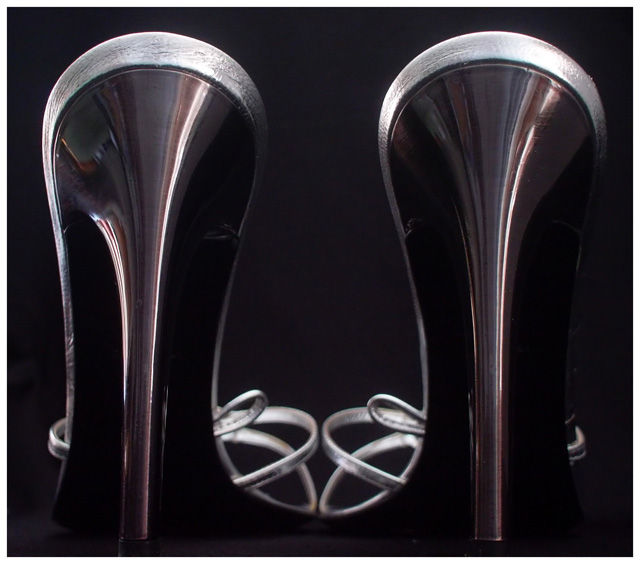
A very unique view of shoes, which is confusing at first glance, but then slowly grows on you. The curves you've gotten are really quite nice. If I have one issue, it is that the setup seems slanted to the right, a little offsetting, but minor.
Background
Nice and clean, and compliments the coloring well.
Camera Work / Technical
First thing I want to touch on is the lighting. Mostly, it's done well, subtly, but I feel that the right side of the right shoe being in full shadow needed to be corrected. The image in my mind would have benefitted if the lighting on that side was the same as the lighting on the left. Falling off into shadow there unbalances the image for me, and contributes to that right-leaning slant I mentioned earlier. Also, your focus seems just the *slightest* bit off at the top of the back of the shoes. I personally love the shallower DOF, putting straps in front OOF.
Digital Processing
You didn't mention any processing, but I think that maybe working on selective colors to try and tweak the muddy burgundy/brown into something a little more dynamic would have also boosted the look of this photo. Just a suggestion though.
Fits the Challenge
While it definitely fits the challenge, it *does* have that initial "what am I looking at here?" thing that can result in turning a 6 or 7 vote into a 5 from people that are in a hurry. Just something to think about. Abstracts really take a certain something to do really well on DPC, I find.
My Opinion of the Photo
Despite the initial confusion, it's a photo that grows on you as you look at it. I like the creativity and simplicity. I'd have liked to see a little more color to it, perhaps more glow in the background, but it works as is too. Good work, and good luck in future challenges.
Beautiful (almost) abstract composition, well balanced which suits the type of shoe. The lighting catches just enough to make the texture jump out, And the very elegant movement and weight in the lines really captures the essence of such a shoe. A tiny flaw, and I'm nitpiocking at this point, is the reflection of the room caught in the left heel. Otherwise I love this pic. 9
Beautiful lines and composition. I like the tones too. At first I didn't like the DOF and the fact that the front of the shoes weren't crisply in focus, but it's grown on me and now I think it wouldn't look right any other way. Great job!
This is very linear and has perfect symmetry, when done so obviously, works. This would make a great poster. I like the light and dark of it as well as the geometry of the straps. This is clever and after 2nd review, I'm upping my score. (:~p)
Reminds me of a couple of pints of guiness... but then there are those wonderful curves of the fronts. Not sure I like the symmetry - I think one single shoe and negative space beside it may have been stronger for me. Can you walk in those? WOW! :o)
I feel good looking at this photograph! It is a stylish, stimulating and uniquely accurate abstract design that also works on a communicative level as well as an aesthetic level, but I don't think that is why it is so much fun. I know why. The high and low linear quality is like a photographic roller coaster. The jumble of light tones at the bottom, a loop-de-loop. This is fun because it an amusement park .... not a pair of shoes. One of my top ten picks for this challenge. 9.
Nicely lit and cool composition that gives this pair of shoes a little bit of interest, one of the few shots that had just shoes in it that I gave more than a 5, it got a 7 from me.
Interesting how you took the heel, not the side view like most other people did. Creative. However the border seems a bit excessive--the black outline of the white border bothers me.






 Add photograph to your favorites
 Add photographer to your favorites

 Photographer found comment helpful.


