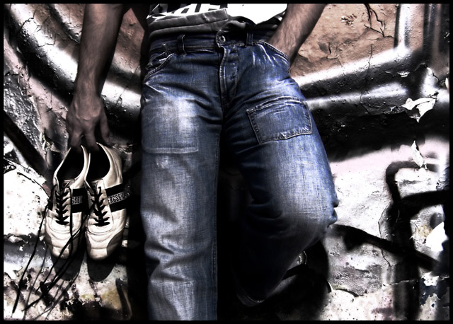
This shows up as way too contrasty on my screen., but I like the idea and the pose, some barefeet would have been cool, background is pretty busy., so it's distracting. I think if it wasn't so contrasty and saturated it would be more visually appealing to me.
The trainers should really have been a different colour say red, because they are lost in the similar colours and shapes of the wall graffitti. It makes the jeans look like they're the subject instead.
I like the filtration on this with it's urban edge. I think I'd crop out some of the area on the right so that the legs isn't dead center. The coloration is rich and the warm of the brown tones against the stark white and black with the blue of the jeans is a nice melange!
I really like the subject of this picture and it is a good composition. The background, however, is very distracting to me. I wonder what it would have looked like on a less busy background...
I like where you are going with the post processing but it needs to be more "pristine" and sharp to totally engage my attention, keep up experimenting though. One of the better shots in the challenge, gave it a 7.
THis is a nice photo however the mans pants drew my attention not the shoes.. i had to look for those. The shininess of the pants is overwhelming to the shoes.






 Add photograph to your favorites
 Add photographer to your favorites


 Photographer found comment helpful.


