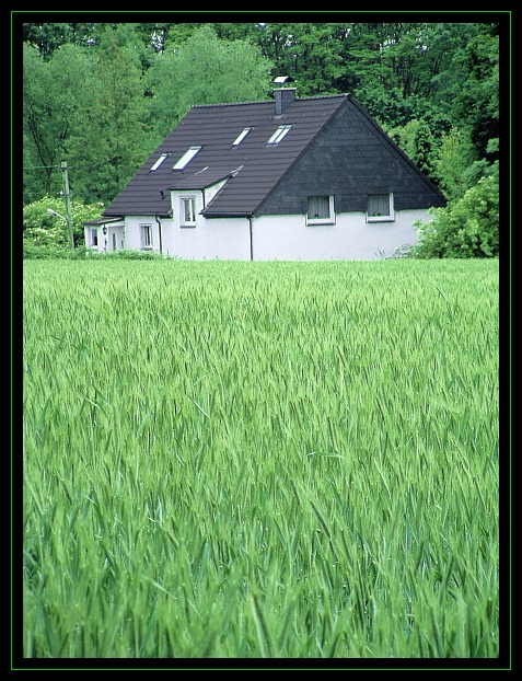
I did very little post processing on this shot. I changed the hue of the green colour channel slightly to give it that "fresh green" look, resized, unsharp masked, and added the border.
Statistics
Place: 14 out of 175 Avg (all users): 6.0676 Avg (commenters): 6.8636 Avg (participants): 5.9362 Avg (non-participants): 6.1770 Views since voting: 1364 Votes: 207 Comments: 24 Favorites: 1 (view)
*Critique Club*
Maybe it's just a reflection of all the green around the house, or maybe the house is a slight green color, but it looks like you tinted even the house with a slight green. See the areas where the dark color meets with the light color on the house? There is a green outline there where it looks like it should be shadow?
Anyway, I do like all the grass in the front. I think this is was they meant when they said "Photograph your home and be CREATIVE".
The house doesn't really have any elements in this section that I find particularily interesting though. Which is why I think it was important for you to do the dramatic perspective with the grass in the shot.
The focus is a slight bit soft on the house, but I don't think we lose any detail there. I like how the house is just sitting there in the middle of all the nature. It's kind of like my house, but we're up on a hill, and all the nature is around us at the bottom of the hill. lol.
The colors of the house seem a bit muted. I wonder if the lighting was tricky this day? I would like to see the roof darkened a bit, maybe if you could adjust the brightness or contrast to get the roof just a bit darker without hurting the rest of the shot, I think that would look good.
Otherwise, I think this is a good take on the challenge, and definately says "Home"
~Heather~
Maybe taking the picture from the other corner and get the back door into it more may add a little more interest to the photo, this corner being empty makes it uninteresting
5. Fits the theme well enough, and there are no blatant 'you suck!' flaws to it, but neither does it really grab me for any reason at all. For reasons of composition, cropping, or subject choice, it's just a photo, and doesn't do especially much for me, aesthetically.
The way you've got it cropped, it's almost about the *grass* ... which is a very odd choice. The house itself is a nice subject, and nestles neatly behind the hill, but the picture as a whole isn't about any one thing (as I look at it, anyway). Good colors; a bit better focus on the house might also have directed there attention better.





 Add photograph to your favorites
 Add photographer to your favorites

 Photographer found comment helpful.


