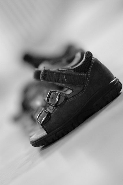
First, our literal-minded members do check the title when voting. It's tough to see 8 sandals, and they noticed.
I wonder how this image would look in landscape mode, and cropped thus filling the frame with the subjet. (Even though the shadows are interesting, they don't add much impact to the image.) I also wonder how this image would look in color, with, say, a bright red sandal front and center.
Finally, just a touch more lighting on the forward sandal would be helpful and a tiny bit more depth of field would make this image pop.
You have a good and sensitive eye. Keep up the good work.
Thank you very much for all the advice and the scoring. I got a second 5+, which really means progress to me. I hope to keep it up and to improve.
I learned here that the title has a certain importance and that it should not be too complicated. I mentioned 8 sandals (which is correct) to emphasize the shallow DOF and make people wonder "are there really eight? ...". I was still playing with a wide aperture of F/1.4.
if the title points to there being 8 sandals, shouldn't there be 8 sandals visible? all I can really see is one, and maybe two or three more blurred in the background. i'd suggest a smaller aperture and higher camera angle for any similar ventures in the future
8? If you say so... A slightly deeper DOF and slightly higher vantage point would have made the other sandals recognizable. But even then, making a row of sandals look sufficiently interesting is tricky.
I like the implied geometry of this picture, how the top left corner has some lines that point at the sandals, and how the shadows from the sandles point to the sandals in the bottom left and bottom right.
I like that the closest shoe is in focus and the other one isn't. I liked the black and white but apparently everyone else liked the black and white, there are so many black and white pictures.
i like the idea for this shot, but i think you might have used a slightly deeper DoF and maybe an angle that would show a little more perspective on the sandals.
Nice composition, I do like the angle and the soft b&w feel of this photo. But the title does not match what you view in the photo. The DOF is too shallow to allow the viewer of the photo to see this. I think the title, in this case, hurts your score.







 Add photograph to your favorites
 Add photographer to your favorites

 Photographer found comment helpful.


