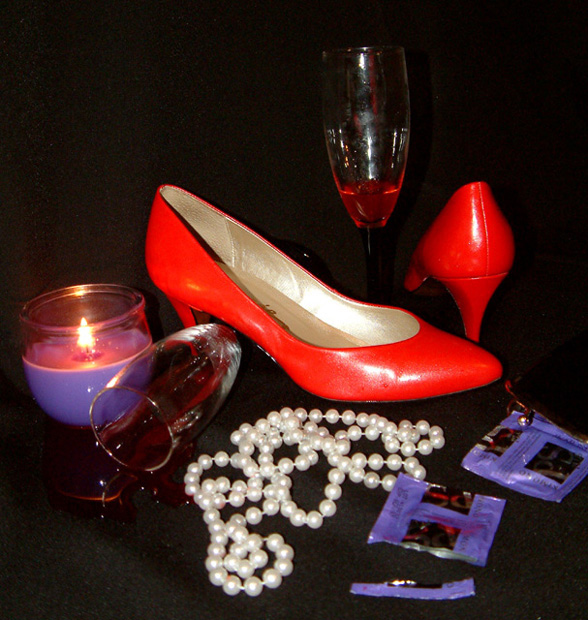
This photo looks much darker on some monitors than others. I feel the darker version looks best.
I had this idea in mind all week but didn't shoot it til the day before the deadline.
I had originally wanted to have one of the glasses tipped over with the drink spilling from it, but thought it would be too messy to work with. I accidentally knocked it over and found out that my background is waterproof, so the liwuid never soaked in. It let me arrange the drink the same as I was arranging the other elements.
I thought the condoms would add interest to an otherwise ordinary photo.
I used a hotshoe manual flash unit with a Promax Lumiquest 80/20 attachment because I didn't want the light too harsh and becasue it was all I had to work with.
Statistics
Place: 365 out of 465 Avg (all users): 4.4760 Avg (commenters): 4.6667 Avg (participants): 4.2500 Avg (non-participants): 4.7353 Views since voting: 1631 Views during voting: 408 Votes: 292 Comments: 14 Favorites: 0
the glare on the wine glasses and shiny shoes from the flash isnt pleasing. maybe you could try using other light source, like a fluorescent? that's my main gripe.
I think the concept is there, but the image seems a bit too contrived, like its carefully arranged to look random, but it just doesn't, it looks carefully arranged.
The black background and foreground don't help because it just makes everything seem like they're just floating in space.
A little too much to handle. I DO like how the wine glass is under the heel of the one shoe, though I would have preferred more interaction between the pearls and the wine glasses. In the back I felt that the wine glass needed more wine. I can hardly see the glass otherwise.
About the first comment: there's a little too much implied in this photo. I don't mean that in reference to the condom packages, but rather in general, though the packages do feel superfluous to this still life. Perhaps another candle to the right of the other heel and no flash at all would have made this photo more sensual and appealing than the stark, bright light. Rather than romantic it feels intrusive.
i like the fact that the shoes are brighter then everything else.u really concentrated on the shoes wich i didn't see a lot of in the other photos.nice work. 10
I don't like this picture for many reason: 1. The lighting makes the shoes a funny orange color. 2. Nobody is dancing so it doesn't match your title. 3. Why is there a candle??? 4. CONDOMS? Geez. Can't you just leave sex out of this? 5. Why is the wine glass spilt from nder the shoe? If you spilt the wine first, and then put the shoe down, you could have picked up the wine! This just kind of grosses me out.
The composition, just like the metaphors, has been pushed to breaking point I fear. There's too much trying to be said all at once, and the cheekiness and wit would be stronger with at least 2 elements removed from the shot. Less is more.





 Add photograph to your favorites
 Add photographer to your favorites

 Photographer found comment helpful.


