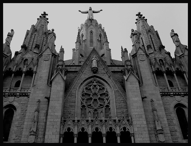
I admit to being prejudiced in favor of churches, which helps. This looks interesting in grayscale, but I think a higher light level (or a brightness adjustment) would have been nicer.
This is a very interesting architectural scene. There appears to be a lot of detail in this structure... It could also work well as a vertical composition where the door would also be visible. This photo seems to be either under exposed or shot in poor lighting. The tonal range is rather flat and the contrast is weak... a different lighting situation may possibly improve this quite a bit :) = 5
Excellent choice. I wonder if having/waiting for the light to fall across the front (if possible) would brigng out more shadow and detail and contrast. A touch flat, but I still adore it. Evening out the crop left to right also, just a bit off, to even it out






 Add photograph to your favorites
 Add photographer to your favorites


 Photographer found comment helpful.
