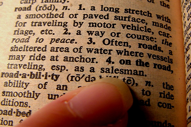
Beautifully done photo - stretching the challenge (heavily!!! really) You are getting alot of text bleed from the print on the opposite side of the page, I think if you insert a blank, black piece of paper, it would help. Am I seeing extra red tint? Lighting - washed out page on the left, strong red color on the right. Photo (would I want this on my wall, no) 4 Creativity 10 (with the stretch) Road (my turn for interpretation) 0 (see you can achieve less than 1 point! a new site record) total 4 (takes your chances.....)
haha.. good interpretation. I might be off base here, but play with the white balance and see if you can get this a little brighter. Other than that, I like it.
This is a well-executed photograph... a little extra white balance or level adjustment would have possibly brightened up the page of the dictionary just a bit more... My overall problem with this particular shot is that it is outside my idea of the challenge topic. It *is* on topic but it does not appeal to me as a great interpretation of this challenge...
No offense to the finger, but if its gonna be part of a photo, have a manicure. Besides the finger I like the photo. It seems a bit bright on the left but not too bad. Texture and color of the paper give it character.






 Add photograph to your favorites
 Add photographer to your favorites


