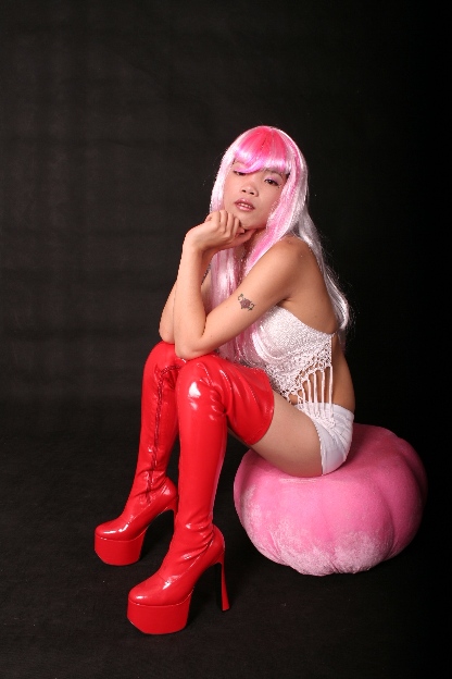
Seems more like a pic of Suzie Wong than her boots. Even as a portrait of Suzie rather than her boots the hair in her eyes is annoying, and there's a lot of empty space above her serving no discernible purpose. You could have made this fit the challenge by using less, like maybe just the boots and the tattoo. Less is more.
LOVE this shot! My only minor criticism is that her hair and arms look oversharpened against the black backdrop - also the background doesn't look uniform in color/texture. Still, GREAT pose, composition, crop, colors. Superior job.
I don´t really want to offend you but the first thing that came to my mind was that I don´t really care for the pose, was this really the best you could come up with? Her standing up, or stretching her legs towards the camera and you using a wide angle lens to emphasize the boots or just anything other than just sitting there... Anyway, I like the lighting (even though that glare on her left knee is pretty "off" but I am sure you would have cloned that out if this hadn´t been a basic editing rules challenge) and composition and backround, definately above average in the challenge. 6 from me.
very striking outfit. somehow she seems to pull it off. beware artifacts of resizing... notice the pixellation of her hair and her arms, easy to avoid and very distracting when it happens.
those are some gnarly boots. lighting on the subject looks aright, though somethin more dramatic couldnt have hurt. the background is a weird distracting texture, i want it to be all black. 6





 Add photograph to your favorites
 Add photographer to your favorites


 Photographer found comment helpful.


