Challenge:Duotones (Classic Editing) Camera:Sony DSC-F717 Location: Yosemite, California Date: May 22, 2003 Aperture: F4.5 ISO: 100 Shutter: 1/2 Galleries:Nature, Water Date Uploaded: May 23, 2003
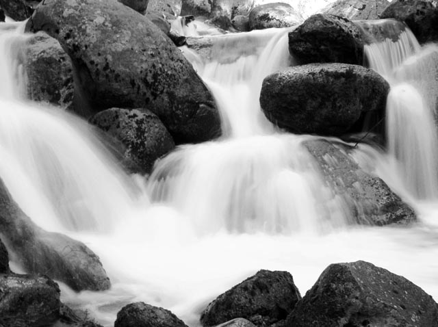
Overall this has a very relaxing affect on anyone viewing it. The rocks are in very sharp focus and you can actually see the texture of the rocks when you look at it. The only thing I might have done differently is shot this at a faster speed. The falls themselves have very little texture or feel to them, they are simply wide strips of white, it very common to with falls to get that look, what you want is to get a look of "angel fingers" where there are very narrow strips of the deep white shades and strips that are almost translucent.
The photo is well composed and balanced, the eye is drawn to the center fall first and then the two outside falls. Keep up the good work it is a beautiful image.
Hmm... I don't think this subject is actually enhanced through a bw treatment. Its a beautiful waterfall and probably wants all its colour to really pop. That said, good composition and tones.
Very pretty shot. Alas, it makes me want to see it in colour. However, in black and white, the water is emphasized, which is nice. Good angle, no one thing draws the eye, which in a photo like this is good as you want to have the gestalt experience. (Actually, I just wanted to use 'gestalt' in a comment.)
Nice water fall effect. Since it was a closeup, the water fall does feel a little abrasive. The way you cropped the picture has me wondering what you didn't want us to see.






 Add photograph to your favorites
 Add photographer to your favorites


