*Critique Club*
I think this is a great representation of home sweet home.
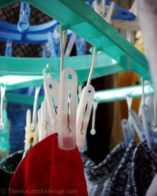
I do find the blue rails to be distracting, as well as the blurry object in the upper right corner. I tried this with a different crop, right above the large clip holding the red article of clothing in the front, and I feel that it works that way very nicely. It eliminates the distracting elements, and also brings the visual focus down to where the main sharpest focus is, rather than us having to look around in the DOF for it.
The color is really good in the shot. I love the way the red is brought out in front of the darker article in the back. I think the DOF works really well here.
The Overall look of this shot is a bit cluttered, however if you were to try the crop I mentioned, it takes out a bit of the clutter as well, making it a bit neater to look at. I don't think you would lose anything beneficial by cropping off the top.
Definatley says Home.
~Heather~
This image is one of the ones I came back to later. I like the mundane-ness of it, and how that can really convey the "home" feeling. The blurry whatever-it-is in the upper right is distracting, but I like the crispness of the red clothes against the greenish drying rack. Just upgraded ya a point. Nice work!
5. Fits the theme well enough, and there are no blatant \'you suck!\' flaws to it, but neither does it really grab me for any reason at all. For reasons of composition, cropping, or subject choice, it\'s just a photo, and doesn\'t do especially much for me, aesthetically.
The eye isn\'t drawn anywhere, though the colors and lighting are nice. A more directed choice of focus, combined with less muddy composition (meaning, what you want us to see is central, and the rest doesn\'t distract from it), might have helped a lot.
very creative! I love love love it! The blue rails at the top are a bit distracting...it would help to clean up the picture a bit. My highest mark so far,







 Add photograph to your favorites
 Add photographer to your favorites

 Photographer found comment helpful.


