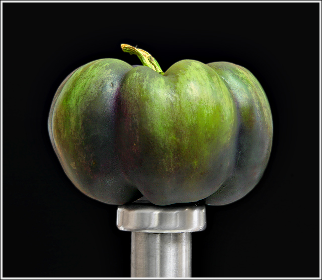
Agree with Arcanist for the most part. Do feel it is a bit soft though. The stand does not appeal to me. Wondering why you did not drape it in black too? Also, would another color background have done more to pop out the subject? I will admit though, it certainly is a change of pace from what is usually presented. My guess is that in a challenge the majority of the comments would be "too soft."
I just got my Tamron 28-75 two days ago. Now, after having said all the above, I've still got to try and emulate your work.
I like it. To me, I think what people are calling softness makes it stand out a bit against the background giving it a 3-d look almost. Colors are good. Contrast between the background and the stand is good too.
I think the BG selection with blur x2px may be the cause of the softness comments, but I dont really see a glaring softness to this. I like the image a lot. Wondering about the tiniting (seems the purple is muted) and would have added a bit of punch in its original form.
Almost a pastel softness to the colors. It also has sort of a "fuzzy" appearance, not as in technical focus, but like the surface is "peachy" or fuzzy. Wonderful feel to the image.




 Add photograph to your favorites
 Add photographer to your favorites


 Photographer found comment helpful.


