First let me say that I remember this shot from the D&L Challenge and thought it was creative and good.
Composition:
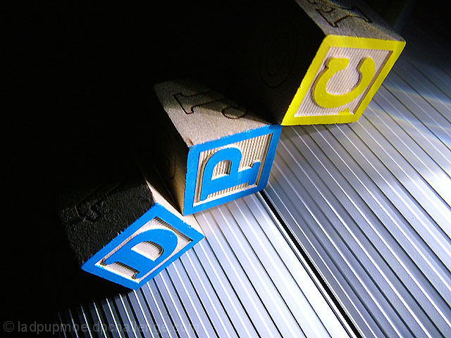
Really nice use of the space. I like the diagonal corner-to-corner line you used - nice variation on the rule of thirds. I also appreciate the fact that not only are the light and dark areas contrasting, but the blue & yellow are as well.
Lighting:
Good, but perhaps a bit harsh. Some of the highlights, while aren't blown, are a bit bright. However, the contrasting light and dark areas compliment each other well.
Focus:
Good, but not quite tack sharp. The added texture of the underlying material is a nice touch though, and adds yet another layer of contrasting elements (smooth surface vs ribbed).
Overall:
A strong entry IMHO. I think the score probably suffered a bit because of the title - there were so many "Dark & Light" entries. I think that this particular image was underrated because of the varying levels of contrasts you presented.
I also looked through your Portfolio - you have some fantastic stuff! And 200+ challenges? Wow.
Clever use of light and dark. Interesting grooved base - is that plastic? I think this might have more pow if done in black and white although the high contrast of the blue and yellow is ok by me.






 Add photograph to your favorites
 Add photographer to your favorites


 Photographer found comment helpful.


