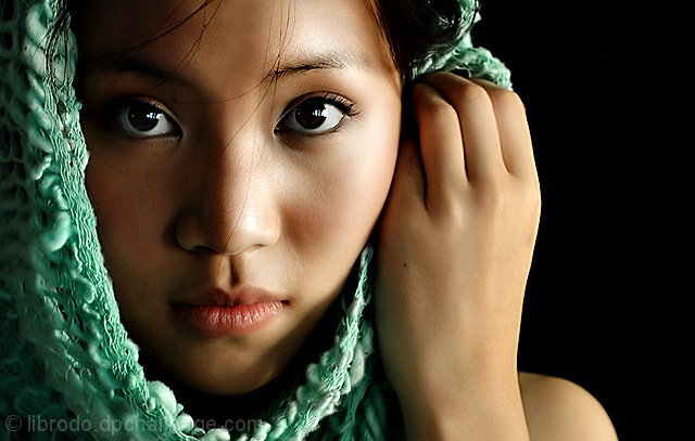
Challenge:D&L (Advanced Editing IV) Camera:Nikon D70 Location: In our school, in my classroom Date: Aug 26, 2005 Aperture: 5 ISO: 200 Shutter: 1/15 Galleries:Fashion, Portraiture Date Uploaded: Aug 28, 2005
Right you are...I took this shot to test what is Pupae's best angle. No plans to enter in the challenge but after looking at it in my computer screen, I am impressed by the clarity of her eyes and the charming and delicate expressions she gave me.
Shot inside my classroom with the black bulletin board as the background. The scarf was borrowed from a co-teacher whom I met in the hallway in the morning as I know it will look good on Pupae.
I hope I made the right choice. I have quite a lot of good shots taken from this "session".
Statistics
Place: 1 out of 200 Avg (all users): 8.1041 Avg (commenters): 8.9452 Avg (participants): 7.7829 Avg (non-participants): 8.4000 Views since voting: 30027 Views during voting: 666 Votes: 269 Comments: 166 Favorites: 104 (view)
Like the rest of the commenters, I love the photo. It captured my attention while scanning the thumbnails. I wavered on the hair on the nose and haven't decided about it. I suppose, if it keeps me interested in the photo, it is an asset. It is no wonder you got 75 tens.
I really like your photography style,have enjoyed looking at your photos,have added you to my favourites.What sort of lighting did you use 4 this photo?
It seems almost superfluous to be critiquing this wildly popular image, since it's already received so many thoughtful responses, but I'll take a stab at it.
Composition: essentially flawless. The use of negative space, the shape of the negative space, is exceptionally fluid. One might wish for a little more forehead and a little more on the bottom to better-complete the arc of the scarf.
Lighting: appears to be classic window-light. It's one of the most recognizable elements in your images. It's actually a fairly "harsh" light for portraiture, but you always manage to pull it off by careful control of the dark values in the face. I might like to see a hair more detail in the upper left portion of the face, above her right eye, but that's a subtle call. The shadow of the scarf on her chin is mildly distracting; had her raised hand been placed an inch further back, the scarf might not have cast that shadow that interrupts the flow of the line along the chin, but again this is a nit.
Color: I basically have no criticisms of the color except that I am seeing a slight cyan/green cast to the whites of her eyes and wonder if you might neutralize this?
Other: IMO, and I see by the comments that I'm not alone in this opinion, this shot shows overuse of neat image. I understand the smooth, graceful, flowing effect you are after here, but I think you can ramp down a bit on the neat image and still have that effect. Indeed, this is my only real criticism of the image; I believe the skin, especially on the hand, is overly plastic-looking.
Wonderful shot, Manny. The bottom line is that this person really comes through as "delicate and lovely", which after all is what you set out to accomplish.
I've been looking at this, and studying and still can't figure out why anyone would give this anything less than a 5. It's a 10 in my book too. Congrats!
Wow, it begs the question if I could ever reach a blue ribbon (translated to majority acceptance in voting) would I want it just to have some "opinion's" thrown at me in a negative manner, since I don't receive too many of those at my current standing.
Either way Manny, I like it. =) Even if saying that groups me with DPCer mentality, so be it. I still like it the way it is. I guess if you belong to DPC than you fall into a certain category for taste...Ah well. ;)
Actually, if it is a 'fashion" photography, I do smoothen the face using neatimage. I also clone out imperfections.
Fashion or not, its those imperfections, and detail in the skin that makes us human different from plastic manequins. I've seen alot of fashion photography in my life and they all do cloning imperfections and do smoothing, but they also maintain a limit that if you cross it it doesn't look human anymore. Plastic like this is only good for DPC. I mean man look what neatimage did to that blue thing covering her head. I doubt the fashion world can accept something like that. Fashion photography must have detail too. If you would of said it's experimental or something like that I would of bought it but fashion is not an excuse for this. No way.
I am only trying to tell you that is wrong to waste your obvious talent going the DPC way. A way that will hardly be accepted anywere else but here. Take it or leave it, it's my opinion. I think that blue ribbon doesn't worth the amount of bad habits people develop on this site. You do how you wish.
Over smoothed, oversharpened, and yet still an 8.1
Unbelievable. Guess that's the prize for being a recognizable and very well liked artist on this site.
Of course, compositionally it is as great as ever, although I'd have loved to have seen a more colorful background. The black seems to really point out the over-sharpening where a more natural background may have helped hide it a little more. Also, once again, would that I had a bank of "exotic" looking people to shoot.. seems to really make a punch with North Americans.
Anyway, for me, a touch less of smoothing and sharpening would give this photo some real life..
Guess that's why I usually don't score well here.
8.1 because it was the best of the lot, not because it was "Over smoothed, oversharpened" as you said, and not because it was taken by manny (anonymous during voting, several people have submitted photos like this in the past).
Vote and comment on the photo, and accept the result, don't be a loser and whine about it.
The reason your photos don't score as high, is mainly because the many hundred voters on this site don't find them as interesting or good as other photos, blaming that on "popularity" or "over sharpen/smoothed" is just plain wrong.
I gave this 10 and I suspected it was librodo, but if it had been anyone else I wouldn't have rated it any different. So I disagree with what you've said.
Look, I have my opinions and I commented them. This is Librodo's comment section, not "attack people" section. If you want to do that, PM me please.
Over smoothed, oversharpened, and yet still an 8.1
Unbelievable. Guess that's the prize for being a recognizable and very well liked artist on this site.
Of course, compositionally it is as great as ever, although I'd have loved to have seen a more colorful background. The black seems to really point out the over-sharpening where a more natural background may have helped hide it a little more. Also, once again, would that I had a bank of "exotic" looking people to shoot.. seems to really make a punch with North Americans.
Anyway, for me, a touch less of smoothing and sharpening would give this photo some real life..
Guess that's why I usually don't score well here.
8.1 because it was the best of the lot, not because it was "Over smoothed, oversharpened" as you said, and not because it was taken by manny (anonymous during voting, several people have submitted photos like this in the past).
Vote and comment on the photo, and accept the result, don't be a loser and whine about it.
The reason your photos don't score as high, is mainly because the many hundred voters on this site don't find them as interesting or good as other photos, blaming that on "popularity" or "over sharpen/smoothed" is just plain wrong.
I gave this 10 and I suspected it was librodo, but if it had been anyone else I wouldn't have rated it any different. So I disagree with what you've said.
NO EXCUSES for comments below. Well, I guess I just know how to adapt my style.
Actually, if it is a 'fashion" photography, I do smoothen the face using neatimage. I also clone out imperfections. However, if I intend it to be a gritty image, I leave it as it is...even make it more grungy. As far as having my work recognized, it can work both ways. The 2 1's explain it.
If you want un-smoothen face...documentary style of photography, I would like to plug my site. Please click the link underneath and please leave some comments. I am very proud of this gallery.
Yes, yes, I looked at your site right after I typed that comment up last night, and THAT is what I like. Those shots are not all "the same", an Asian girl on the left hand side of the frame, you know? No offense, at all...It just seems that a lot of your entries here on DPC have been just that. Girls in the left two thirds with pretty eyes. (please don't get mad at me! *begs*)
Your site shows some more, some totally different shots, and that is awesome. : )
NO EXCUSES for comments below. Well, I guess I just know how to adapt my style.
Actually, if it is a 'fashion" photography, I do smoothen the face using neatimage. I also clone out imperfections. However, if I intend it to be a gritty image, I leave it as it is...even make it more grungy. As far as having my work recognized, it can work both ways. The 2 1's explain it.
If you want un-smoothen face...documentary style of photography, I would like to plug my site. Please click the link underneath and please leave some comments. I am very proud of this gallery.
Over smoothed, oversharpened, and yet still an 8.1
Unbelievable. Guess that's the prize for being a recognizable and very well liked artist on this site.
Of course, compositionally it is as great as ever, although I'd have loved to have seen a more colorful background. The black seems to really point out the over-sharpening where a more natural background may have helped hide it a little more. Also, once again, would that I had a bank of "exotic" looking people to shoot.. seems to really make a punch with North Americans.
Anyway, for me, a touch less of smoothing and sharpening would give this photo some real life..
Guess that's why I usually don't score well here.
As I also commented during challenge, I completely agree with everything Artyste says. It's a pitty that this site has become a "whoever is the most popular in the forums" wins. No offence intended to librodo, and nothing against him, it is the only image I commented in the challenge, that means it clearly triggered my attention, I really feel the image would be wonderful with regardless how much noise. Like this it looks like the poor girl is wrapped in a plastic bag, a manequin a doll anything but human. You have true talent it is obvious and it's a pitty that you ruin your work just to please the DPC forums audience.
However congrats for the ribbon.
Agreed.
"Nothing fails like success."
JV
I agree as well...And no offense at ALL to Manny, please don't get me wrong. I just think that, more often than not, if someone recognizes a popular photog's work here on DPC, they will give it a high score, regardless of whether or not it is terribly creative or well done.
*shrugs*
But yes. Congratulationa on the ribbon, you do rock, librodo! : )
Congratulations! As always ... you continue to amaze me!
Hurray for you ! It would be great if you could share your lighting set up, I believe that with all you great photographers out there sharing your experience, we have a lot to learn and gain.
Wonderful photo. I just love the strands of hair falling across the face. It makes it so human and real and also proves the technical skill (rock solid sharpness + good depth of field)utilized in taking the photo. Congratulations.
Over smoothed, oversharpened, and yet still an 8.1
Unbelievable. Guess that's the prize for being a recognizable and very well liked artist on this site.
Of course, compositionally it is as great as ever, although I'd have loved to have seen a more colorful background. The black seems to really point out the over-sharpening where a more natural background may have helped hide it a little more. Also, once again, would that I had a bank of "exotic" looking people to shoot.. seems to really make a punch with North Americans.
Anyway, for me, a touch less of smoothing and sharpening would give this photo some real life..
Guess that's why I usually don't score well here.
As I also commented during challenge, I completely agree with everything Artyste says. It's a pitty that this site has become a "whoever is the most popular in the forums" wins. No offence intended to librodo, and nothing against him, it is the only image I commented in the challenge, that means it clearly triggered my attention, I really feel the image would be wonderful with regardless how much noise. Like this it looks like the poor girl is wrapped in a plastic bag, a manequin a doll anything but human. You have true talent it is obvious and it's a pitty that you ruin your work just to please the DPC forums audience.
However congrats for the ribbon.
Agreed.
"Nothing fails like success."
JV
I agree as well...And no offense at ALL to Manny, please don't get me wrong. I just think that, more often than not, if someone recognizes a popular photog's work here on DPC, they will give it a high score, regardless of whether or not it is terribly creative or well done.
*shrugs*
But yes. Congratulationa on the ribbon, you do rock, librodo! : )
Over smoothed, oversharpened, and yet still an 8.1
Unbelievable. Guess that's the prize for being a recognizable and very well liked artist on this site.
Of course, compositionally it is as great as ever, although I'd have loved to have seen a more colorful background. The black seems to really point out the over-sharpening where a more natural background may have helped hide it a little more. Also, once again, would that I had a bank of "exotic" looking people to shoot.. seems to really make a punch with North Americans.
Anyway, for me, a touch less of smoothing and sharpening would give this photo some real life..
Guess that's why I usually don't score well here.
As I also commented during challenge, I completely agree with everything Artyste says. It's a pitty that this site has become a "whoever is the most popular in the forums" wins. No offence intended to librodo, and nothing against him, it is the only image I commented in the challenge, that means it clearly triggered my attention, I really feel the image would be wonderful with regardless how much noise. Like this it looks like the poor girl is wrapped in a plastic bag, a manequin a doll anything but human. You have true talent it is obvious and it's a pitty that you ruin your work just to please the DPC forums audience.
Over smoothed, oversharpened, and yet still an 8.1
Unbelievable. Guess that's the prize for being a recognizable and very well liked artist on this site.
Of course, compositionally it is as great as ever, although I'd have loved to have seen a more colorful background. The black seems to really point out the over-sharpening where a more natural background may have helped hide it a little more. Also, once again, would that I had a bank of "exotic" looking people to shoot.. seems to really make a punch with North Americans.
Anyway, for me, a touch less of smoothing and sharpening would give this photo some real life..
Guess that's why I usually don't score well here.
As I also commented during challenge, I completely agree with everything Artyste says. It's a pitty that this site has become a "whoever is the most popular in the forums" wins. No offence intended to librodo, and nothing against him, it is the only image I commented in the challenge, that means it clearly triggered my attention, I really feel the image would be wonderful with regardless how much noise. Like this it looks like the poor girl is wrapped in a plastic bag, a manequin a doll anything but human. You have true talent it is obvious and it's a pitty that you ruin your work just to please the DPC forums audience.
Over smoothed, oversharpened, and yet still an 8.1
Unbelievable. Guess that's the prize for being a recognizable and very well liked artist on this site.
Of course, compositionally it is as great as ever, although I'd have loved to have seen a more colorful background. The black seems to really point out the over-sharpening where a more natural background may have helped hide it a little more. Also, once again, would that I had a bank of "exotic" looking people to shoot.. seems to really make a punch with North Americans.
Anyway, for me, a touch less of smoothing and sharpening would give this photo some real life..
Guess that's why I usually don't score well here.
This photo is absolutly magnificent. I can't believe some people gave it a 1, its a 10 in my book. I love the way you caught the light in her eyes. It feels like she is right here with me. Contgrats on another ribbon. I am sure you are excited about the new challenge.
I am typing this in-between classes. Thank you so much everyone. I didn't expect it to win much more to get an 8 + . I felt I tried so much to fit it on a D and L theme and felt short. Pupae was also a greenhorn in posing.
And yes, she will be in my next class. She will be surprised to see herself in the page of DPC.
Salamat. After 3 dismal scores in the challenges, this is what I need.
This got my 9 and then a bump to 10. Manny: you are indeed a wonder revealing untold beauty with so much warmth and wonder. You remain virtually unrivaled when it comes to capturing the essence of beauty.
My warmest congratulations on receiving the Blue for this challenge.
Beautiful although I'm seeing this type of shot far too often. Dont get me wrong because it is technically perfect and extremely well done. It is the classic Librodo photo that I unfortuately see over and over again.
The color of the wrap is fantastic...the coolness of the "agua" contrasted against the warmth of her skin, just perfect. I also really enjoy the contrast of texture happening here... the nubby softness of the wrap against the silkiness of her flesh...really well seen and truly lovely.
As much as I like the image the neatimage or noiseninja or whatever you did to it anoyes me. It's just unnatural looks like freaking plastic doll. I prefere noise no matter in what amount. I'd love to see this without it.
Although this imagry / subject is getting quite cliché IMHO, nevertheless yoiur image is quite stricking both emotionally & technically. Excellent skin tones, near perfect composition & great catchlights. I wish the hairs had not been so far down on her face (cloned out for future use?). Great work.
This photo is absolutely stunning..the best in challenge I believe...lovely fabric contrasts well with softness of image..good lighting and position of model..I like the stray hair strands, too.
This is amazing. The framing is perfect, the presence of the shoulder (which many would have left out) adds a pleasant dischorant element, and the tones are so rich. Not to mention she's mighty pretty and those eyes... well my brain goes to mush if I look for too long.
I have been looking at this for a while trying to figure out whether this is Manny, or just someone doing a pretty good job of imitating him.
My final decision is that it is Librodo. In which case it's another great portrait, but maybe lacking a little something that some of your other shots have. She's a beautiful girl, the lighting is spot on, but perhaps it's a little too contrived. Still, it's an eight from me.
Now now we all know who took this, and we all know this is going to ribbon right? ;) The eyes of course are magnificent, the colours, the delicatness of the skin, the composition, the background, the model the sharpness, the lighting, the contrast, the strands of hair falling onto her face, details, every little thing is perfect and you really really do know how to work you model. I really can't say anything that hasn't been said before.
I can't vote becauese I'm not a fully paid up member but if I could, this would get a ten, Well done it's absolutely beautiful and of course is the model!
Beautiful model with wonderful eyes. The lighting is great, as is the fabric. I have to admit that this is the first shot I've looked at in this challenge, but I'd like to predict a Top 3 here already.
Beautiful portrait. The lighting is awesome. Her hair wisping down over her nose is a nice touch. Love the seafoam green shawl around her head. This is simply gorgeous. 10






 Delicate & Lovely
 Add photograph to your favorites
 Add photographer to your favorites


 Photographer found comment helpful.


