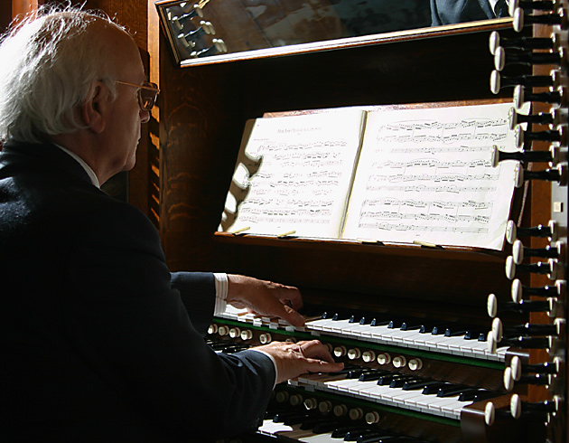
Well composed (pardon the pun), though there are a few things that I imagine would make an immediate difference in the photo. Firstly, the aperture could be closed down a bit in order to get the composer in better focus - the large aperture used here has left a good deal of the picture with a sort of out-of-focus feel. If you were trying to only focus on the hands, it's not quite noticeable enough.
Also, the range of light in this photo includes lost detail in the shadows as well as the highlights - though it may not have been feasible, a bit of white cloth over the window (or whatever light source) may have avoided the blown highlights (relatively important here) and let you catch some details in the shadows (not quite as important here).
the subject is interesting, but the lighting is a bit off. i think you needed to expose for the sheet music, and let everything else fall as it may. the keys and hands would have been well exposed. the shadow on the left looks very odd. i would have cropped out the levers on the right only because they are uncomfortalby soft compared to the rest of the composition. does he have the mirror to make sure the audience doesn't get too unruley?
I have mixed feelings about the knobs on the right edge of the image; overall I think that I'd rather see them either moved a bit further into the frame or cropped out entirely. The light coming over the man's shoulder is a bit strong, causing the music sheet, his hair and a few of the keys to be overexposed. Adding a light source to the side of the man that's closer to the camera would have evened out the light enough that you wouldn't have to sacrifice the highlights.
I don't know what "dolce e legato" is, so I'll take your word for it. :) I really like this shot. Wish the sheet music wasn't so bright, but it's not too distracting. Very nice work here! 8






 Add photograph to your favorites
 Add photographer to your favorites


 Photographer found comment helpful.