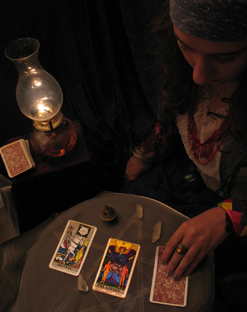
All the elements and the angle in which the shot was taken make this an excellent composition. There are a few secondary subjects in the shot but the many colors of the Tarot card draw us to those as the main subject. The shot comes across with a less is more feel about it.
The crop provides a well laid out story, I don't believe that I would have done it any differently. The negative space near the top center works wonderfully to force the viewer to sneak a glance at the fortune tellers face every so often.
Many commenters eluded to the light of this shot and you, yourself, pointed out monitor calibration.
When working with dark shots on DPC you really have a small window to work for those who do not calibrate their monitors regularly. I do calibrate mine frequently as I myself have been bitten by the too dark/too light voters.
That being said I think the shot here has very nice lighting that sets the mood that you are trying to convey. However I think that I may have worked the highs/mids just a tad (and I mean tiny bit) to bring up the young lady's face and lighten the white garment to bring the necklace out a bit. At the same time being careful to not lighten the negative space that adds tremendously to the shot.
As I critique these shots I bring them down to my PC and study and adjust without taking away from what I believe the photog intended. In the case of your shot here, the only thing that I might have done differently is to adjust to adjust the highs/mids with the slightest of glow to give it even more mood.
If you have the Virtual Photographer Plug-in for your editor apply the Radiant Filter using the defaults to this and you will can see how a little more softness/light makes the story unfold without sharpening the elements of the shot. The old 50% Transparent Layer + increase the Saturation + Gaussian Blur to that layer trick would also work with shot as well to give us a more somber feeling.
Excellent Composition and Story telling as is...Great Work.
I like your composition and the photo in general. for me, if there had been a bit more dramatic lighting and shadows - this would be a terrific photo! Bumping it up a point after a second look :-)
The lighting seems a little flat and therefore it just looks like the picture isn't really popping. I do love the composition and the setup. You should've brought the cards out by maybe dodging them, as well as the ring, that could have created a dramatic image. Great idea nontheless.







 Add photograph to your favorites
 Add photographer to your favorites

 Photographer found comment helpful.


