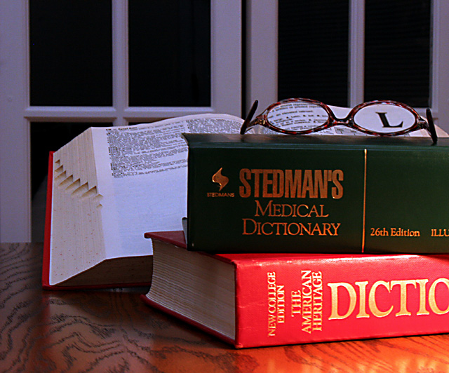
Hi there. I really love the idea behind this image. Very clever and excellent set up. I think the only thing that really hurts the image for me is the lighting. Kind of harsh toward the bottom right and a bit dark on the book in back.
The book not having words on the bottom half seems odd to me also, but nothing that impacts the image. The L is excellent. By looking at your image, I would be able to know the D and L without looking at your title. Focus seems a bit soft toward the back, however on the books in front it is pretty good. I like how the glasses are off to the right of the photo and not dead center of the photo. Makes us look around and notice it subtly. The window in the back makes for a neat background in my opinion as well. A solid background would make this seem TOO set up. As is, it almost looks like an accidental find. Really neat job.
~Heather~
Like the idea and the shot is very good. The composition of the "L" in the image is a bit far left to be as effective as it might have been and a plain background would have been better.
The text on the open dictionary, particularly that seen through the glasses, looks fake, perhaps as a result of oversharpening. The illumination and color draw my eyes to the bottom right corner of the image, and it took me a moment to realize that the glasses were the intended focal point. This is a solid concept; better illumination, a shallower DoF and perhaps converting this to B&W could have made this a ribbon contender.
Something just looks very artificial about this. I'm sorry, it just doesn't "grab" me. I think the background is too busy and the lighting could be better. Interesting concept though




 Add photograph to your favorites
 Add photographer to your favorites

 Photographer found comment helpful.


