Getting tired of the self portraits, but my friends refuse to model :P
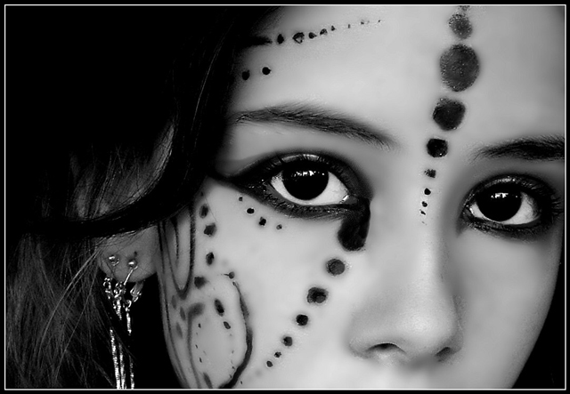
And yes. That is eyeliner all over my face. Great fun to wash off.
----------
editing: crop, contrast, gaussian blur, cloning, dodge, burn, b/w, border, save for web.
Post Challenge: Woohooo, 4th place! Thank's everyone for the comments and high votes. And btw, yeah, I know the editing and make-up is a bit sloppy, I was in a hurry.
Statistics
Place: 4 out of 200 Avg (all users): 7.2317 Avg (commenters): 8.3200 Avg (participants): 7.0924 Avg (non-participants): 7.3500 Views since voting: 8363 Views during voting: 648 Votes: 259 Comments: 99 Favorites: 84 (view)
As I had commented on this shot earlier, I'll elaborate on it at this time. I find the overall quality of this shot amazing. The original sense of it shines through. The focus is good and the lighting showcases the facial features as well as the jewelry she's wearing, without it being harsh or overdone. There seems to be a little bit of smudge on the right side of her nose, but not enough to truly detract from the overall image. I wonder what seeing her whole face, or part of her mouth would have done? I don't miss it, but it might have added to the effectiveness of the image. The clarity of the eyes is spot on and I find the contrast to be enough to really give this capture the POW factor. I look forward to seeing more of your photographs in the future. Best wishes, Judy
Interesting photo, however... i dont like the gaussian blur in this one, it has been made too obvious, and you can tell where the gaussian has been removed...
Well done on your 4th place however
I am so adding this to my favorite list, and beyond that I think it may be my absolute favorite. I want this on my wall. Absolutely incredible, congratulations and well-done. Keep those ideas coming Annah, because its photos like these that keep me coming back.
i have to agree that the editing is a little sloppy. i would love to have seen how it looks without the gaussian. the edges around the makeup makes them look to me a bit like wounds.
having said that, i have to jump on board with all that admiration. the lighting is fantastic. and the crop worked out really well. you're certainly photogenic. great eyes, and catchlights in them. and nice artistic job on the eyeliner and all. very creative.
I knew this was you. : )
Congrats, but just so you know, if you keep up like this, I will have to start hating you...just ask Joey. Cuz you're way too much better than me! Not fair! :P
Annah i love your work.. this was surly a winner..
i think its over gaussian blur though.. more natural look would bring it to first 2...
good job.. i understand you about the model thing..
nice detail. editing your neat image copy on another layer in your photo editor and erasing around the eyebrows, tip of the nose, and some of the paint would really help remove the overly doll like appearance and improve your score...if you care about that.
Are these Annah's eyes?
I like the idea and the b&w.
Photo seems a bit too soft. I would prefer to have it a bit more grainy. Other then that a very nice take on the challenge!
good composition and such annah, but the oversoftness ruins it for me. the dots look like welts on your face because of the tone edges. I'll still vote pretty high though :-D
This looks a little oversharpened, and the lack of texture on the face makes the model look somewhat plastic and artificial. Something about the large spot running from the edge of the eye looks odd. The lighting is good, and the catchlight draws attention to her eyes with good effect; the DoF is good. Nicely done Annah.
Beautiful photo. Seems like it may be just a bit over sharpened because it looks likeyou can see glue holding her dots on and it;s distracting. Still i give it a 9 for everything else, color, composition , focus are all great.
Very nice in many ways, unusual and interesting. But it looks oversharpened around the nostrils, eyebrows, and most of the dots/lines. In any event, I like the idea and the framing, and the model has very nice eyes. 7
when you lay a blur over the entire photo and then spot erase, make sure you feather it to blend into the original picture, or use less of a blur. It's also important to erase the area's of the blur that are covering sharp details. IMO I would have loved this picture without the blur.
This is a ribbon-winner in my book. If I had any criticism, I don't like more than very suble processing on skin. This is a bit too much for me...but just a bit. I think it's most noticeable under her left eye. Great subject. 10.
What a beautiful photo. I love your idea here. Love the detail in the hair. Skin seems a bit too processed around the cheeks and forehead. However this could be the laptop monitor. Will check in AM on CRT and follow up with you....
The deepness in the eyes is amazing and attractive. Overall beautiful shot!
Although the composition, the contrast, the tones, etc are execellently executed, I am giving this a 10 because I just love this young lady's eyes, I could stare into them all day. :)
Beautiful... I don't know if this is a traditional face art kind of thing, or something set up merely for this challenge. But the idea is splendid and was carried out with great success. Good luck in the challenge!
I think I recognize the model here (and she always does great work so if I'm not right, please take it as a compliment!). Very creative and I love the b/w. The softness and hardness of the image are quite refreshing and the stare is fantastic. Great crop. Some of the "dots" seem a bit off (not especially crisp or well painted on), BUT that's a very small criticism. 9
Unmistakably annah :) Excellent lighting and contrast. I love the soft and smooth skin tones, and a good creative effort in the challenge interpretation. The razor sharp focus and piercing eyes really hold my attention to this photo.
This seems very similar to me... hmm... ;)Anyway surely a ribbon with those dots and lines. You did certainly a great makeup job, maybe I could wish the paint was perfect but it really doesn't have to be, the softness of the skin really makes up for it. Great choice of B&W as well, the dark big eyes are magnificently placed into the crop. The only real thing that's annoying me here is the earings, they're brighter than the eyes and because they're also placed on the third of the frame, they really take your eyes. It would have been lot better without them. But hey, it's still a beautiful photograph nontheless.
it just doesn't get much better than this! her eyes are absolutly mesmerizing. the tones are nearly flawless and i love the runny/watercolor look of the paint on her face.
I'm pretty sure I know who this is ;)
You've outdone yourself on this portrait. The composition is excellent. The liquid eyes are well captured and the face 'painting' makes the picture so unique. I really hope you get the blue!!!
The only tiny thing I might change is the small amount of overprocessing on the right side of the image by the nose and the cheek.. but it's not that noticeable.
Well done!!





 Add photograph to your favorites
 Add photographer to your favorites

 Photographer found comment helpful.


